When we visit a website or simply look at an advertisement, the first thing our brain processes is color. Yes, unconsciously, we pick up a constant flow of colors that influence our emotions and can affect how we behave. This impact is what the color psychology.
Color is a silent but very powerful communication tool.. A tool that we can and should use to influence the way in which the consumer perceives our brand and the product/service we market.
For this reason, in ORIGEN we help you strategically choose the right color to engage your audience. Join us today to explore the meanings behind colors. We offer interesting tips that will help you choose the right colors to drive sales. Let's get started!
Select the right color for sales!
The saying goes "to suit all tastes, colors". But how to get so many colors? You need to know how to combine at least three of the color properties: hue, lightness and saturation.
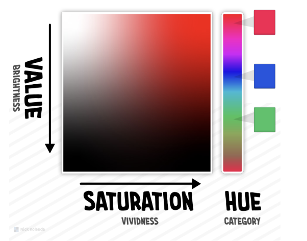
For example, as simple as changing the saturation can evoke a completely different emotion.

Of course, cultural differences and personal preferences can intensify or relax these effects, but colors also have a universal meaning.
The TONE of color and its meaning (HUE)
The hue or tone is that which denotes the color. For example, "green", "blue" and "red" are shades. Each pure hue conveys an important message.
- Green, blue and purple serve to transmit serenity and positivity. They are useful in the web design to create a sense of tranquility.
- The brown. It is associated with nature and with the warmth. For example, it is often used in products containing chocolate or coffee, or where it is desired to emphasize the attractive organic.
- Red is associated with the passionto the love and to the war. It is a color that powerfully captures the customer's attention. In addition, red can create a sense of urgency and makes the product more attractive.
- Fuchsia and orange are eye-catching shades, vibrant y stimulants. They transmit beauty.
- Yellow it is a color that stimulates and attracts the consumer young. In addition, it helps to make quick decisions in the purchasing process.
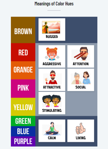
You also have to keep in mind that depending on each country or culture, color can have different connotations or meanings.
For example, in many countries the red is associated with fire, violence, war, love y passion. But it can also be associated with danger or something important. At China is associated with the happiness and prosperity.
The LUMINOSITY of color and its meaning (BRIGHTNESS)
The value describes the brightness of the colors. This property allows you to take a pure tone and create:
- Brighter shades (near the white). They are refreshing y sharp. They evoke joy and invite action. Use them to convey to the customer that the option you are presenting to them is convenient and more economic.
- Darker shades (near the black). They are more heavy. In sales, they convey the impression that the products are durable, exclusive and with more value.
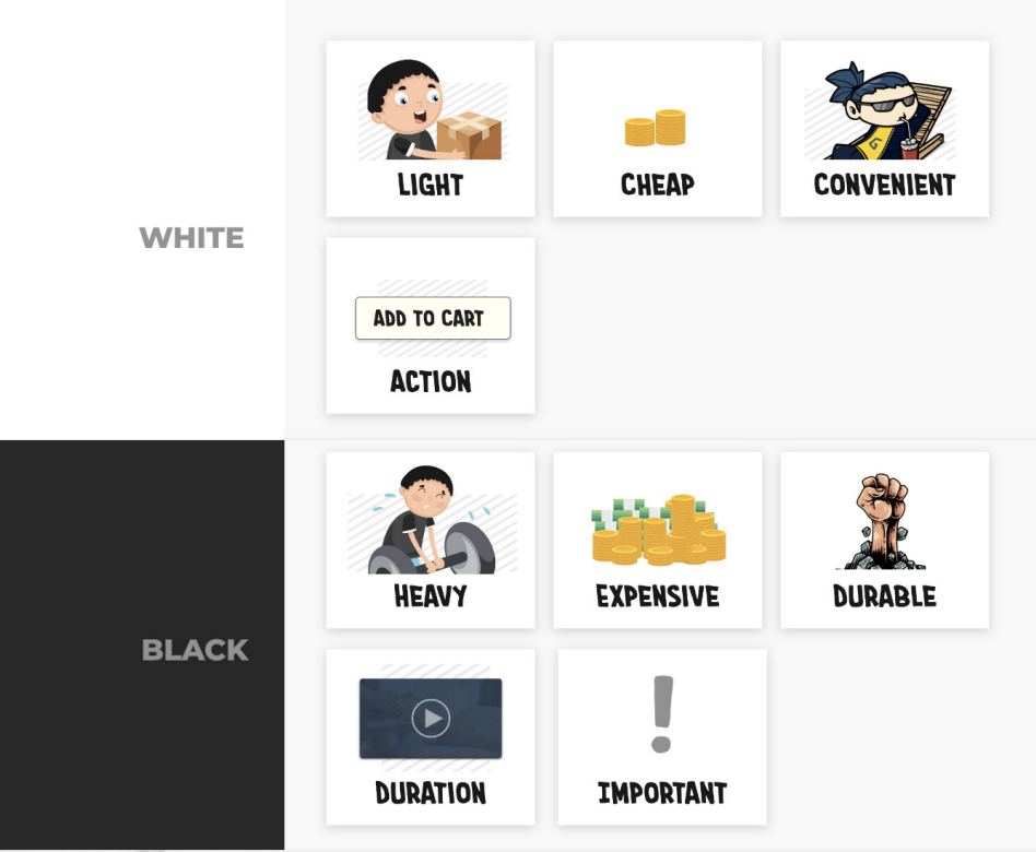

Therefore, depending on the characteristics you want your product to reflect, you should use more or less bright colors.
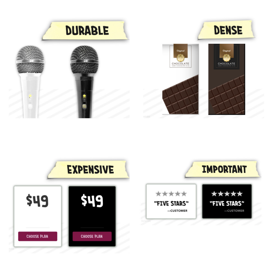
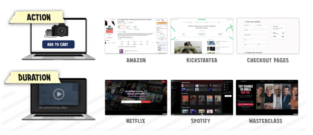
Dark interfaces. They hold visitors back. Because actions seem more difficult, exit actions (e.g., quitting) also feel complicated. Dark colors make them feel heavier.
The saturation of color and its meaning (SATURATION)
Saturation can be described as the vividness of the tone. So, depending on the degree of saturation you can get stronger/stronger or paler/weaker colors.
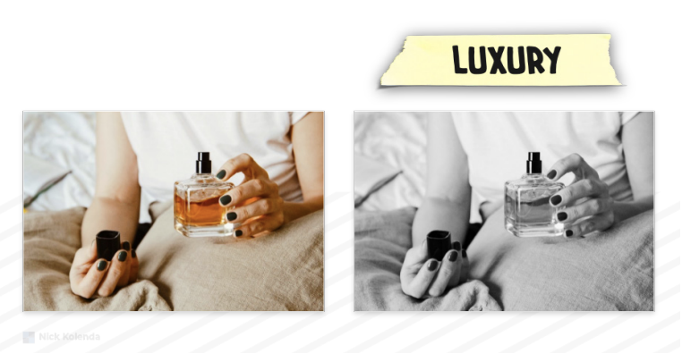
- With low saturation the color starts to become more white/gray. This creates an impression of greater peace of mind, distance y luxury.
- With high saturation you get intense tones, the colors in their purest state. In this way you can convey the feeling of proximity o larger size. For example, if you are promoting a product, choose a saturated color to publish the deadlines, so they will seem closer.
If the size of the product is important for the purchase decision, uses saturation of color for change the perception of the product dimension you offer. Objects with a high saturation color will be perceived as larger by consumers.


For exampleIn one image, lower the color saturation of a carry-on suitcase to make it look small enough.

How to choose the best color combination?
To facilitate color matching, it is helpful to know some of the traditional color schemes:
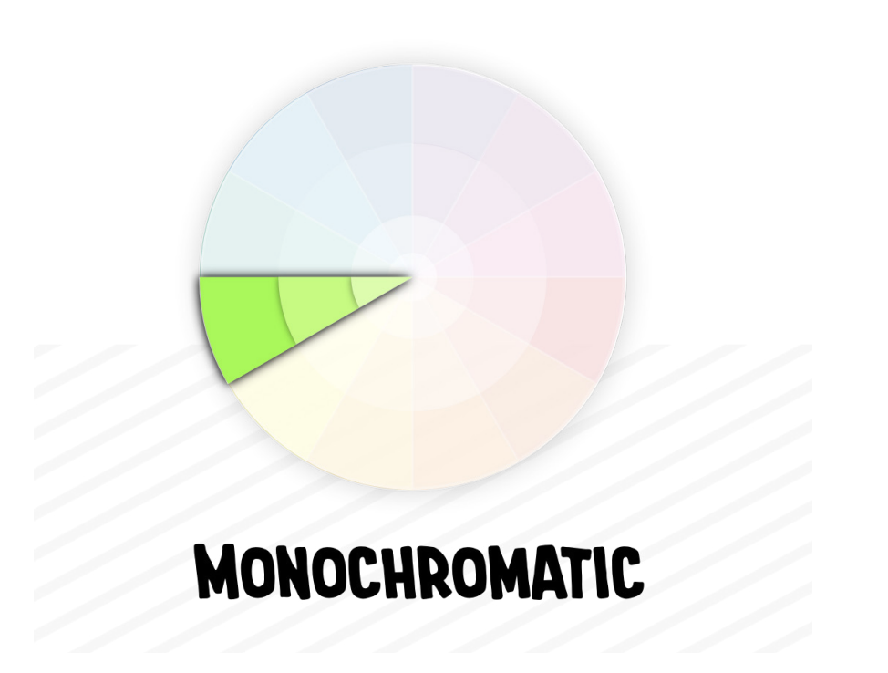
Monochromatic Colors
The monochromatic scheme is the simplest and is composed of several variations of a single tone. For example, you can combine different shades of green. This scheme conveys consistency in design and is useful for differentiating the various product lines you promote.
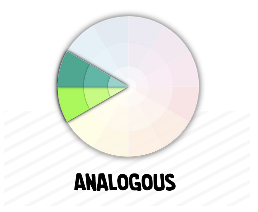
Analogous Colors
The similar scheme is created using three consecutive colors in the chromatic circle, which ensures a harmonious combination. This scheme conveys confidence and expertise, and is widely used in the design of advertisements, banners, logos and websites. An example would be teal, green and yellow-green.
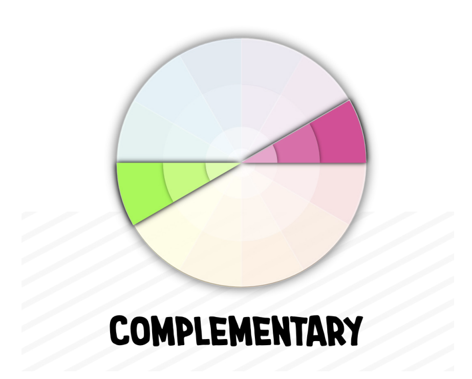
Complementary Colors
The supplementary scheme is formed by combining two opposite colors in the color wheel. This combination increases contrast and effectively captures attention. It is ideal for highlighting key elements, such as call-to-action buttons or menu items.
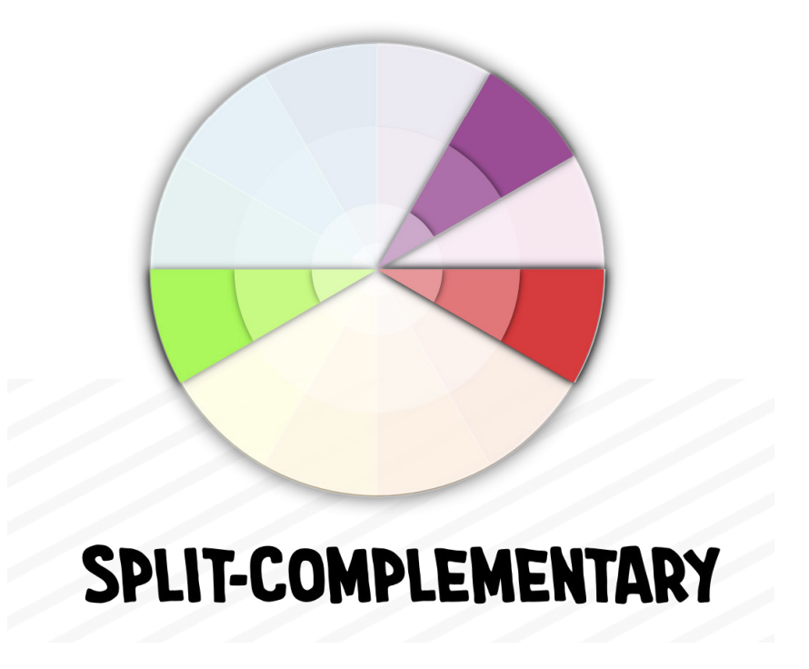
Split-Complementary Colors (Split-Complementary Colors)
The supplementary split diagram is a variant of the complementary scheme. A base color is selected and, instead of choosing its opposite color in the color wheel, the two colors adjacent to it are chosen. This scheme offers high visual contrast without being as intense as the traditional complementary scheme. It is useful for creating attractive but balanced designs.
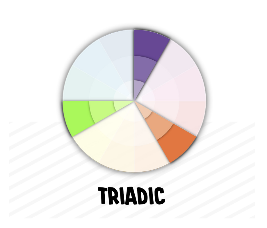
Triadic Colors
The triadic scheme is created by selecting three colors that are evenly spaced on the color wheel. This combination provides vibrant contrast and visual balance, ideal for bold and dynamic designs. An example of a triadic scheme would be to use red, blue and yellow in a design.
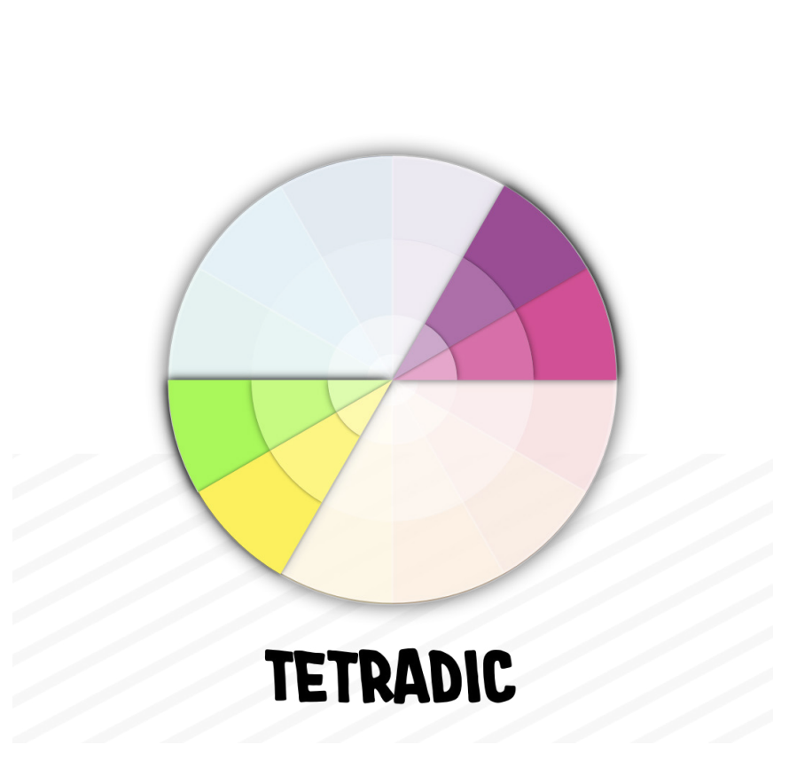
Tetradic Colors (Tetradic Colors)
The tetradic scheme uses two pairs of complementary colors, forming a rectangle within the chromatic circle. This scheme allows great versatility and variety, but requires balance so as not to overload the design. It is ideal for projects where a wide range of colors is desired, such as branding or dynamic websites.
Tips for choosing the right color for your business
As always, from ORIGEN here are some extra tips.
Choosing the right color for a business is a strategic decision that can influence brand perception, attract the right audience and foster an emotional connection with customers. Here are some tips for selecting the ideal color for your business:
1. Define your brand personality
Color should reflect the values and personality of your brand. Think about how you want your customers to feel when they interact with your business: confident, relaxed, excited, creative, etc.
- BlueTransmits confidence and professionalism (ideal for technology or financial services companies).
- RedEvokes energy, passion and action (common in the food and sports sector).
- GreenAssociated with nature, health and wellness (perfect for sustainability or personal care businesses).
2. Know your audience
Research your target audience: age, gender, cultural preferences, and how different colors can influence their purchasing decisions.
- Youth: Bright and bold colors.
- MayoresMore sober and soft colors.
3. Think about the psychology of color
Each color has an emotional and psychological charge that impacts how customers perceive your business. For example:
- BlackElegance and sophistication.
- YellowOptimism and joy, although it can also generate alertness if used in excess.
- OrangeInnovation and creativity, ideal for startups or disruptive businesses.
4. Consider the cultural context
Colors can have different meanings depending on the culture. For example, in some Asian countries white is associated with mourning, while in the West it represents purity. It is important to adapt colors to the region where you operate.
5. Don't overload your color palette
Keep the palette simple and consistent, ideally between 2 to 4 colors that complement each other. Too many colors can be confusing and look unprofessional.
6. Research your competition
Look at the colors your competitors use and try to differentiate them to stand out. However, make sure that the colors chosen are still appropriate for your industry.
7. Test and adjust
Test different color combinations on your logo, website, and marketing materials to see how your audience responds. First impressions can be revealing.
8. Consistency across all channels
Once you choose your color palette, apply it consistently across all your communication channels: website, social media, stationery, ads, etc. Consistency reinforces brand recognition.
These tips will help you select colors that are not only visually appealing, but also connect with your audience and convey the essence of your business. Would you like us to help you choose a palette for your current project?
Contact us at. At ORIGEN we specialize in the development of customized web projects, tailored to our clients' needs.
