

¡Hola a todos! Si necesitas salir del bucle de buscar siempre «diseño bonito», aquí tienes más de 50 palabras clave para explorar referencias en Canva, Pinterest, Savee y Dribbble. Encontrarás estilos, técnicas y tipos de composición que puedes combinar según lo que necesite tu proyecto.
Whether you're working on a new project or just looking for fresh ideas, this list has something for every style and mood.
I know what you are thinking: "How do I choose the right design style?"
It will depend on what each project and each client evokes in you, that's the magic! From retro futurism to minimalist streetwear, estas referencias están aquí para ayudarte a explorar nuevas direcciones y hacer que tus diseños destaquen.
Let's make it even better:
What's your favorite design trend, or do you think I've left one out? Let me know what you think in the comments and together we can keep this list growing and updated with the latest!
Cómo buscar inspiración en 2026: combina palabras y referencias
Una palabra como «minimalism» abre muchas puertas, pero también devuelve referencias muy distintas. Para acercarte a tu proyecto, prueba esta fórmula: formato + sector + estilo + detalle. Empieza con dos o tres términos y añade otro si los resultados siguen siendo demasiado amplios.
Por ejemplo, pasa de «retro» a «coffee packaging retro illustration». Cambia solo una parte cada vez: «coffee» por «skincare» para explorar otro sector, o «retro» por «minimal» para comparar estilos. Prueba también su equivalente en español; los resultados pueden cambiar según la plataforma y el contenido disponible.
Búsquedas listas para probar
- coffee packaging retro illustration: ilustración retro aplicada a envases de café.
- skincare branding muted color palette: identidad de cosmética con colores suaves.
- music festival poster bold typography: carteles donde la tipografía tiene protagonismo.
- portfolio website bento grid: composiciones modulares para un portfolio.
- restaurant menu hand drawn: menús con recursos dibujados a mano.
- editorial layout serif photography: combinaciones de fotografía y tipografía serif.
Son puntos de partida para experimentar: si aparecen pocas referencias, elimina un término; si hay demasiadas, añade el formato o el detalle que te interese.
Ajusta la búsqueda a cada plataforma
- Canva: selecciona Plantillas para buscar diseños de la biblioteca y añade el formato, como «retro coffee menu». En el editor, la pestaña de plantillas permite consultar resultados con Search o crear propuestas con Generate mediante Canva AI. Describe la pieza, el estilo y la jerarquía que necesitas.
- Pinterest: cuando encuentres una referencia cercana, utiliza la búsqueda visual y selecciona la zona que te interesa. Un recorte de la composición o de un objeto puede abrir una búsqueda más concreta que la imagen completa. En algunos Pines también aparecen palabras sugeridas para afinar resultados.
- Savee: Savee.it ahora redirige a savee.com. Sus herramientas de búsqueda por imagen y color permiten partir de una referencia visual cuando cuesta ponerle nombre. Prueba una imagen de partida o un color para explorar contenido similar.
- Dribbble: combina tu consulta con los filtros de etiquetas, color y periodo. Por ejemplo, busca «bento dashboard», concreta una etiqueta y filtra por el color del proyecto. Compara el último mes con todo el histórico para ampliar tu selección.
Un ejemplo de prompt para Canva AI: «Crea un menú vertical para una cafetería, con ilustraciones retro, dos colores, títulos grandes y tres secciones: cafés, desayunos y dulces». Después, adapta los textos y revisa que precios, títulos y descripciones se lean bien.
Del buscador al moodboard
Guarda una selección breve y anota qué te interesa de cada referencia: la paleta, el ritmo, la tipografía o el tratamiento de las imágenes. Agrupa las ideas por dos o tres direcciones visuales y compáralas con el objetivo del cliente. Así el moodboard te ayuda a tomar decisiones y a explicar por qué una dirección encaja con el proyecto.
56 palabras clave para encontrar inspiración en diseño gráfico
- Brutalism // Neu Brutalism
- Gradient Leak // Spectral Gradients // 3D Gradients
- Retro Futurism Design
- Minimal Monochrome
- Font Mixing and Creative Fonts
- Anti-design Graphics
- Surrealism Design
- Abstract Mask Shapes
- Expressionism
- 90s Editorial Design
- Retro Pixels
- Scandinavian
- Metallic // Metallic Typography
- 3D Design
- Minimalist Streetwear
- Hand-drawn Doodles
- Cartoon
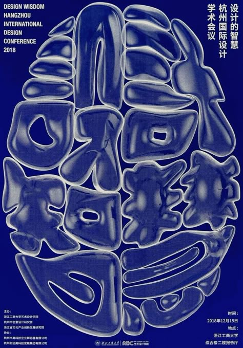
- Trippy // Liquid Type // Melted Type // Fluid Typography // Liquid Retro Display Typeface
- Bold Minimalism
- Psychedelic
- Retro Logo
- Stickers
- Overprint
- Maximalism
- Utilitarian Design
- Indie Groovy Graphic
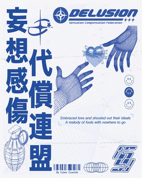
- Cybercore Design
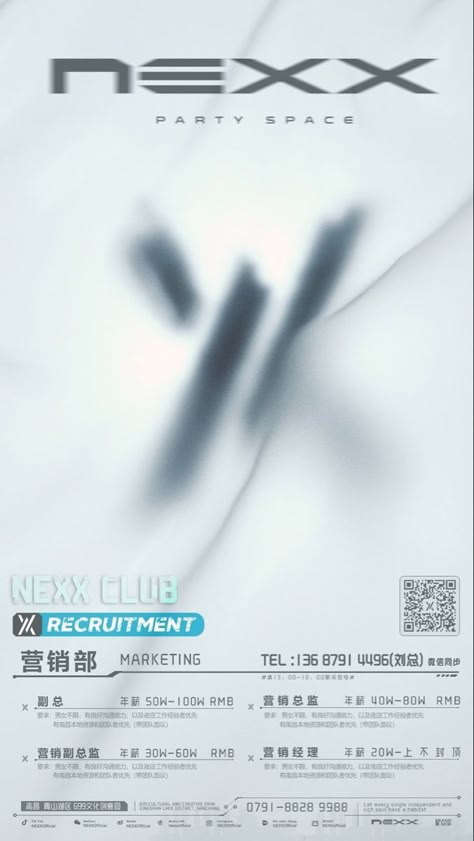
- Glass Blur & Distortion // Glass Effect // Glass 3D
- Motion
- Minimalism
- Retro Boho Graphic
- 3D Abstract Posters
- Y2K Shapes
- Anime Poster Design
- Visible Grid Lines
- 60's Jazz Posters
- Foil printing
- Graffiti in Graphic Design
- Hand Lettering
- Cubism Design
- Analogue Design
- Folk Botanical
- Pop Art
- Futurism
- Punk Poster
- Packaging Illustration
- Duotone colors
- Texture
- Serif Designs // Sans Serif Designs
- Muted Color Palette
- Photo Layering
- Dot Display Graphics
- Grainy Film Look Photography
- Retro Japanese Poster
- Bento Layout
- Collages in Graphic Design
Hint: the customer rarely tells you in words what he wants, so you can try to guide him visually with this list of keywords.
And now let's delve one by one into more detail:
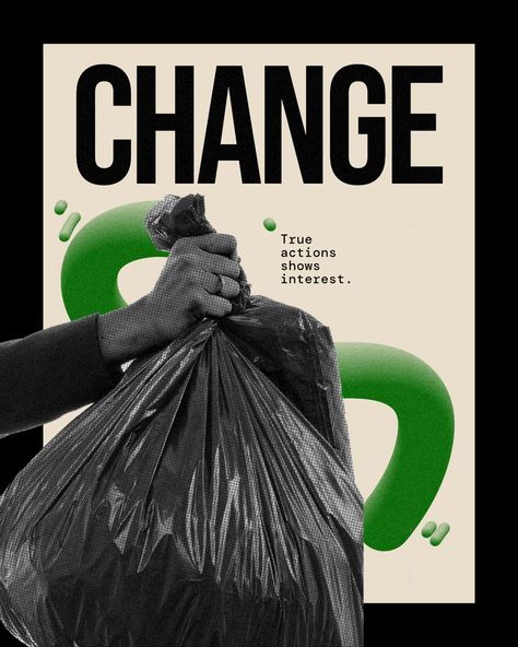
1. Brutalism // Neu Brutalism
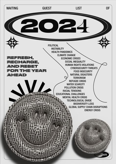
This style is characterized by its raw, simple and functional appearance. In graphic design, it uses flat colors, basic fonts and a no-frills aesthetic. It is strong, hard, and sometimes even uncomfortable, but very effective when you want to convey something without frills.
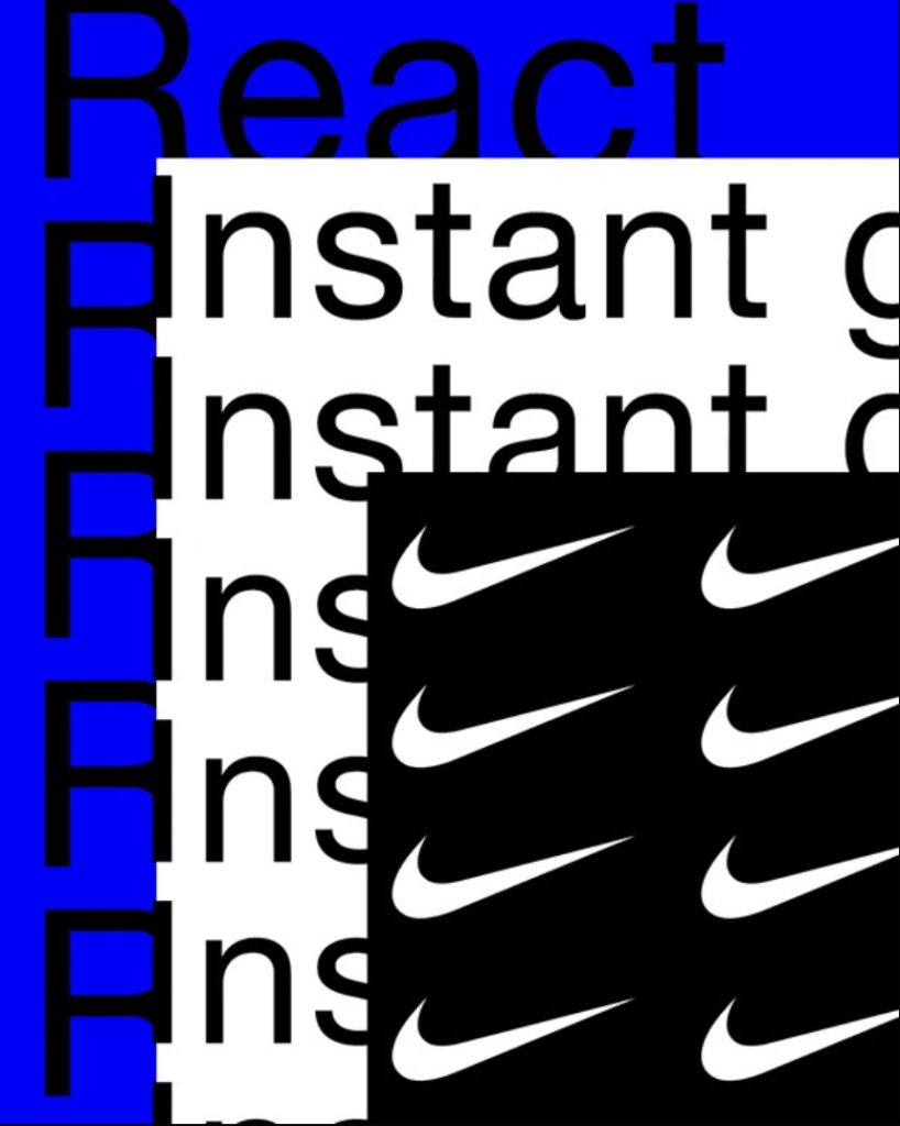
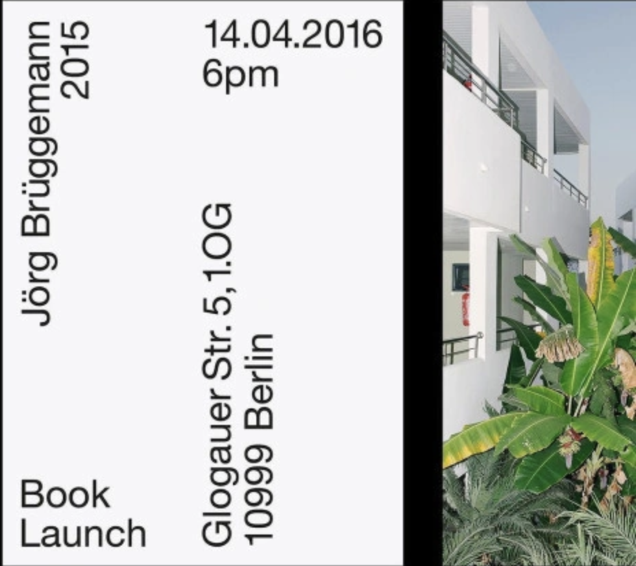
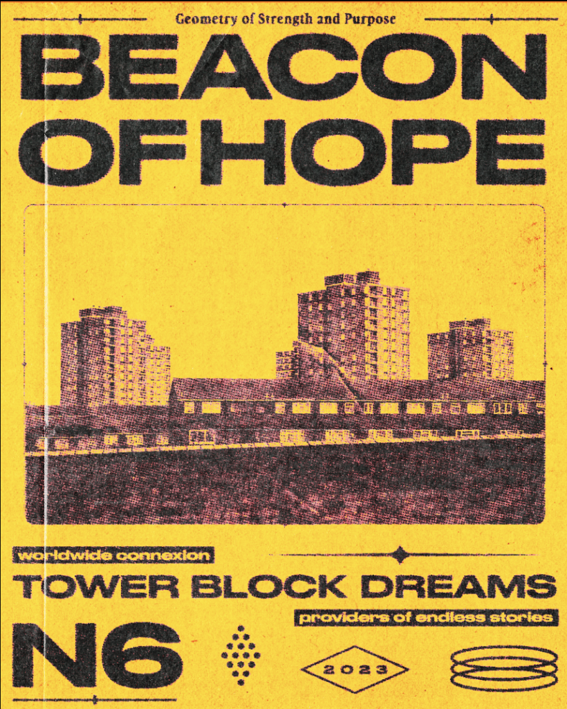
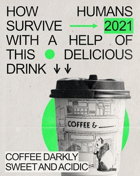
The "neu brutalism"is a modernized version of brutalism that uses basic shapes, angular typography and contrasting colors, but with a more polished touch.
2. Gradient Leak // Spectral Gradients // 3D Gradients
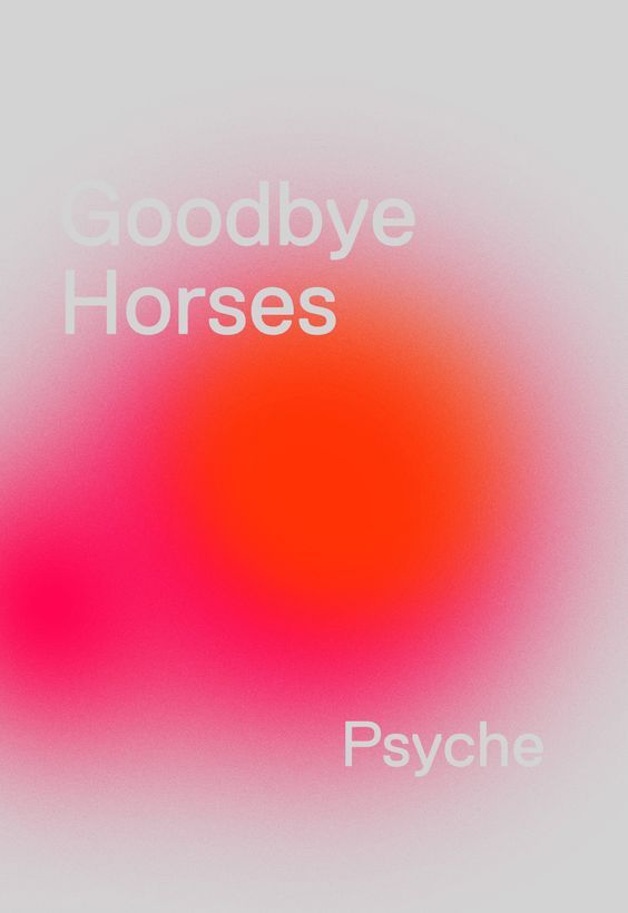
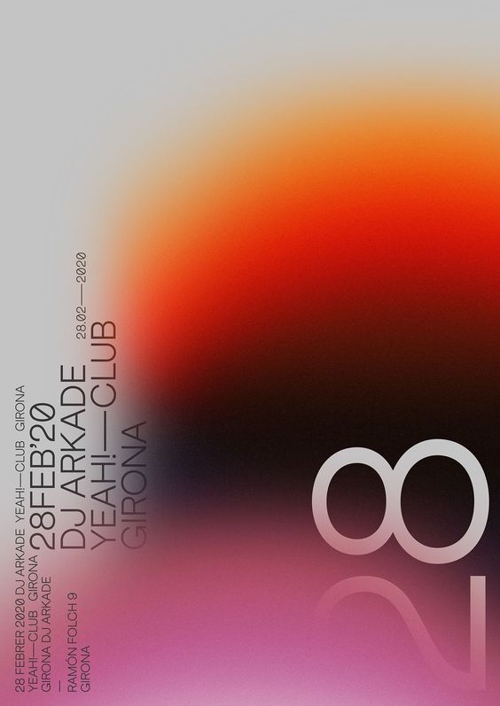
The gradients have always been popular, but this specific approach, the "gradient leak" allows colors to "leak" or "seep" into the design, creating smooth, almost accidental transitions between shades.
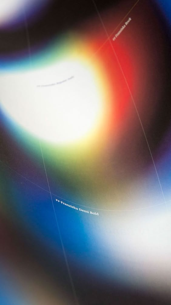
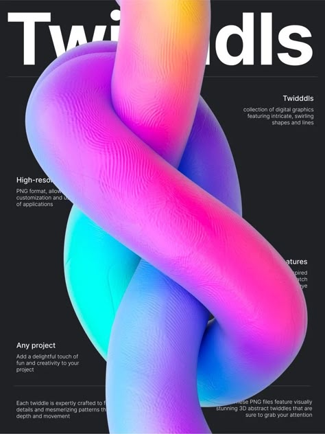
Another keyword variant to search for on Pinterest or Canva, are the "spectral gradients"These gradients mimic the refraction of light, creating rainbow or spectral effects. These vibrant colors add a futuristic and eye-catching touch to the designs.
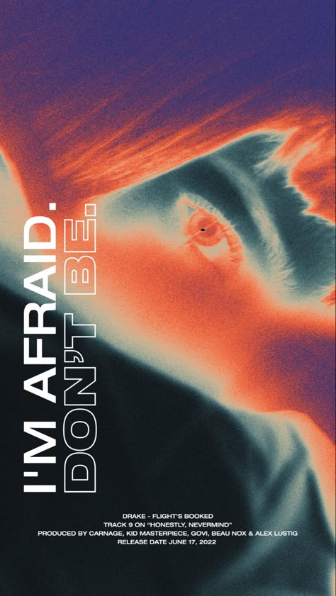
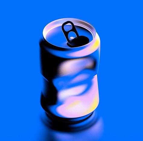
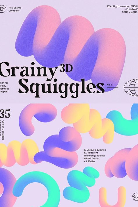
Una última variante es «3D gradients»: combina volúmenes tridimensionales con degradados para explorar composiciones luminosas y con profundidad. Nos flipa.
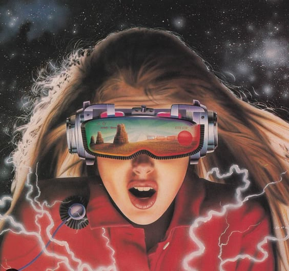
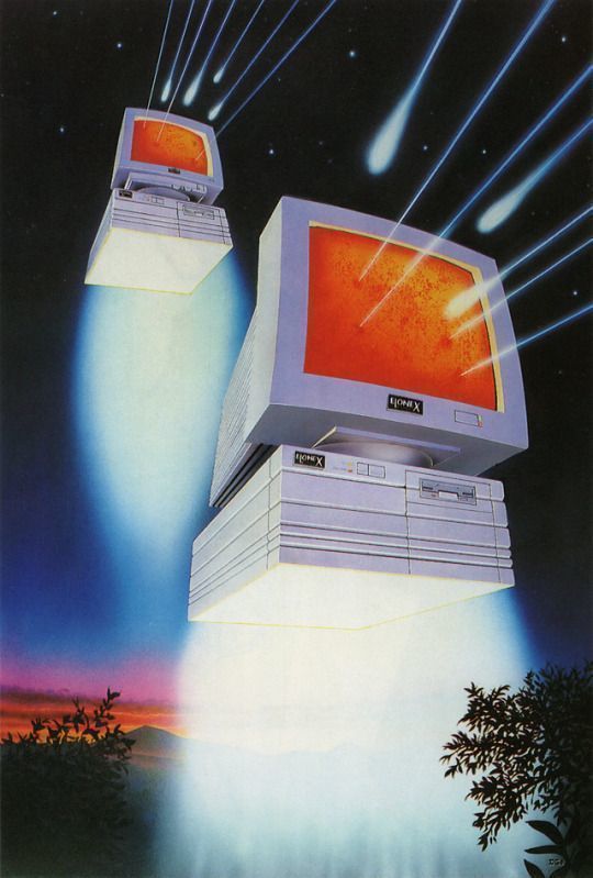
3. Retro Futurism Design
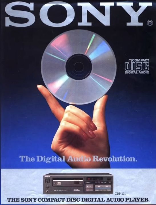
The retrofuturism combines nostalgia for the past with futuristic visions, based on how previous generations imagined the future. It is a style that reflects the contrast between the expectations of the future in past eras and the current reality. It uses technological and science fiction elements from the mid-20th century, fused with vintage aesthetics.
4. Minimal Monochrome
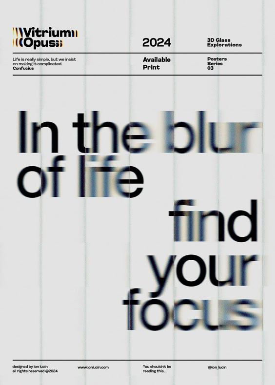
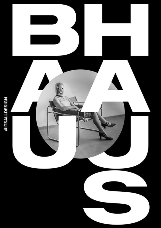
Minimalism in its purest essence, using a monochromatic palette (a single color or shades of one color) to create simple, elegant and sophisticated designs.
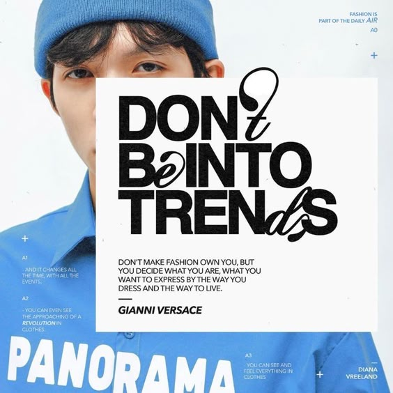
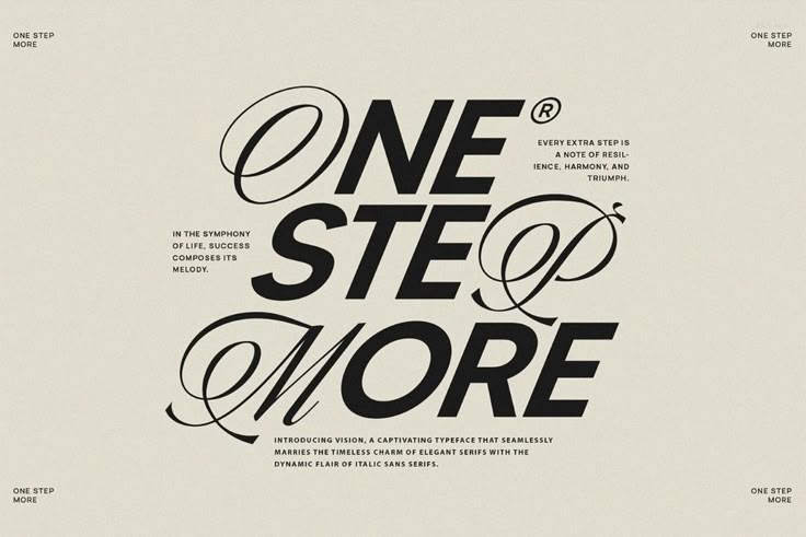
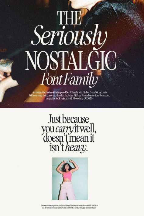
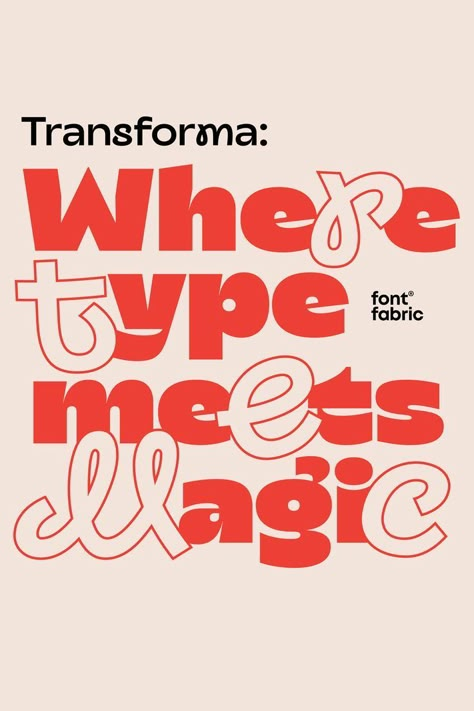
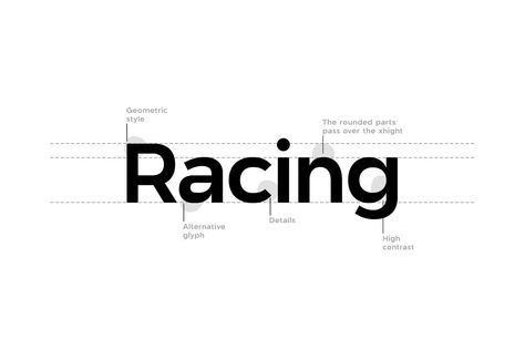
5. Font Mixing and Creative Fonts
La mezcla de fuentes tipográficas diferentes, algunas veces contrastantes, para crear un diseño dinámico y visualmente interesante. Es ideal para captar la atención y jugar con la personalidad del texto. Prueba esta palabra clave cuando quieras explorar contrastes entre una tipografía protagonista y otra de apoyo.
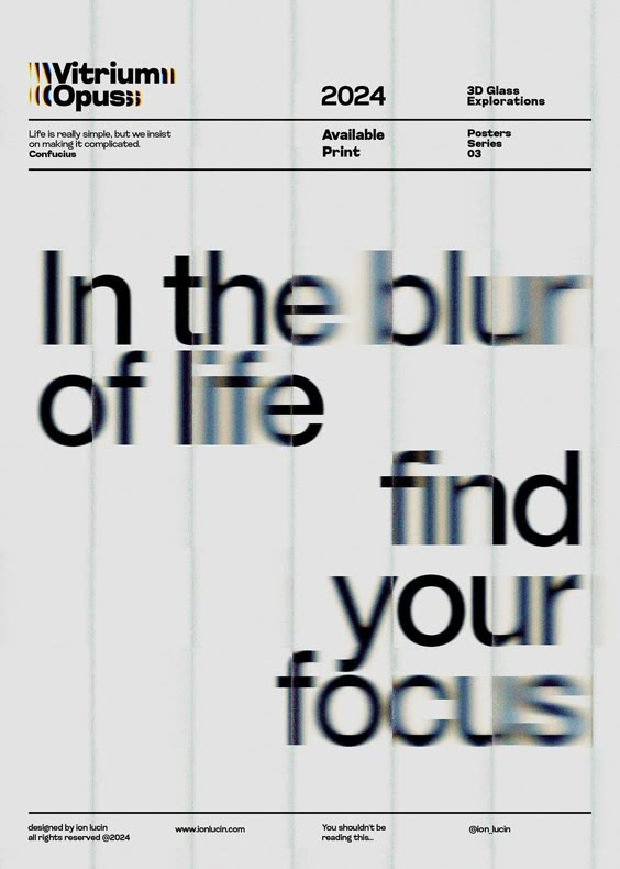
6. Anti-design Graphics
This style defies traditional design rules by being intentionally chaotic, asymmetrical or messy. It is a statement of rupture with conventional design.
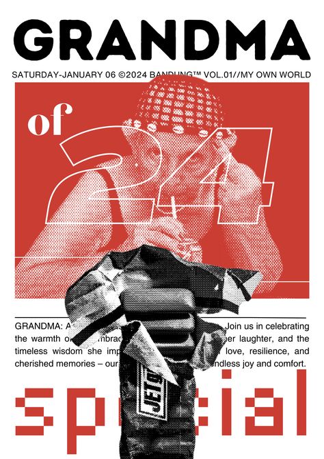
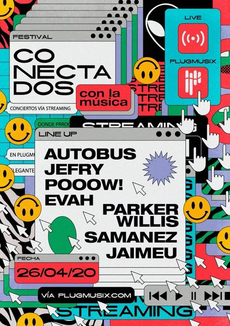
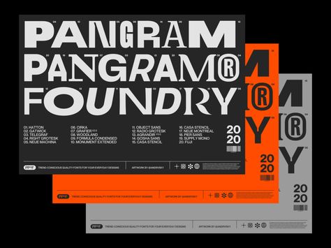
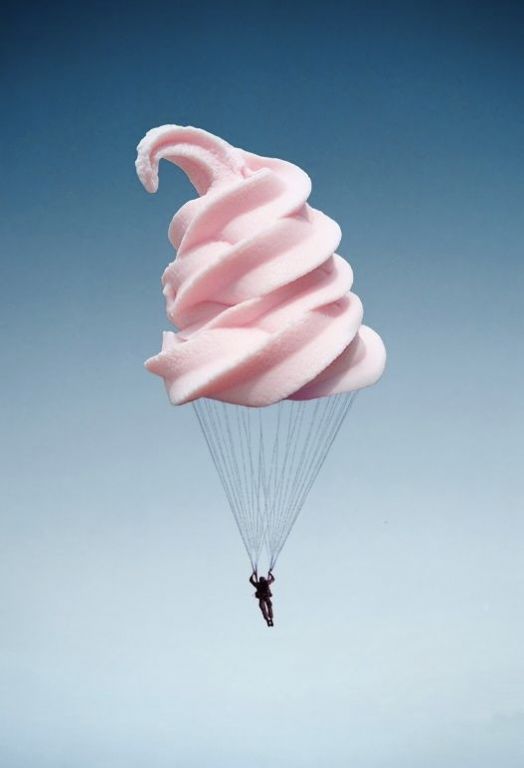
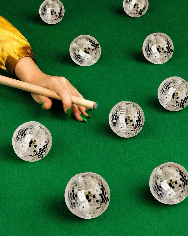
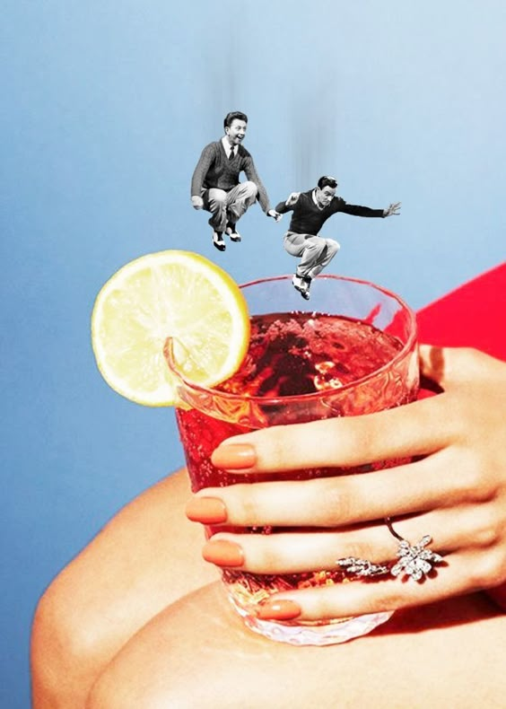
7. Surrealism Design
Inspired by surrealist art, this style combines unexpected or impossible images and elements, creating a dreamlike, strange and fantastic atmosphere.
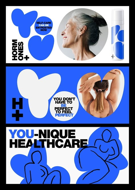
8. Abstract Mask Shapes
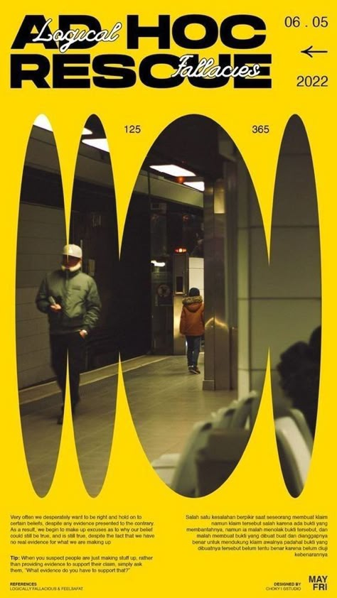
These are abstract shapes that "mask" or cover other parts of the design, creating layers of interest and an experimental look.
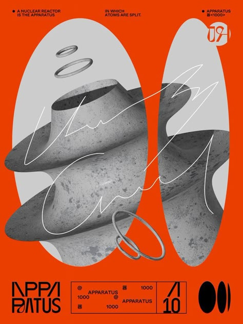
9. Expressionism
This style seeks to convey intense emotions through bright colors, distorted shapes and an energetic aesthetic. It is passionate and artistic.
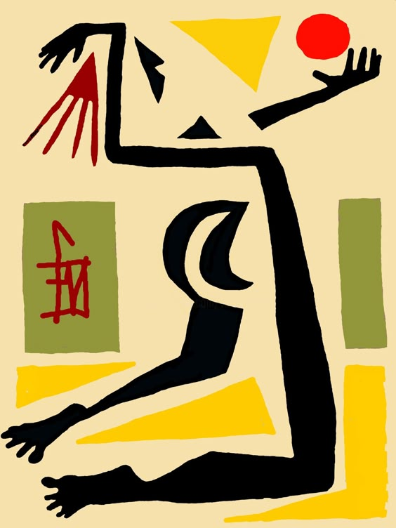
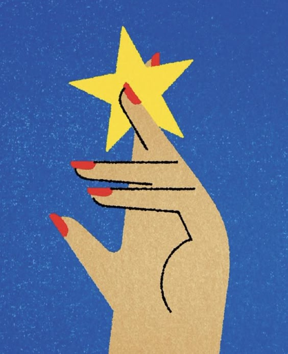
10. 90s Editorial Design
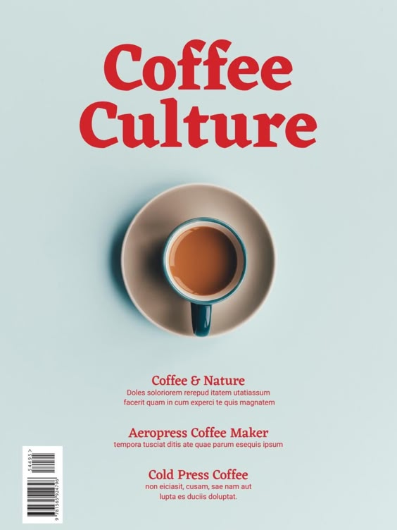
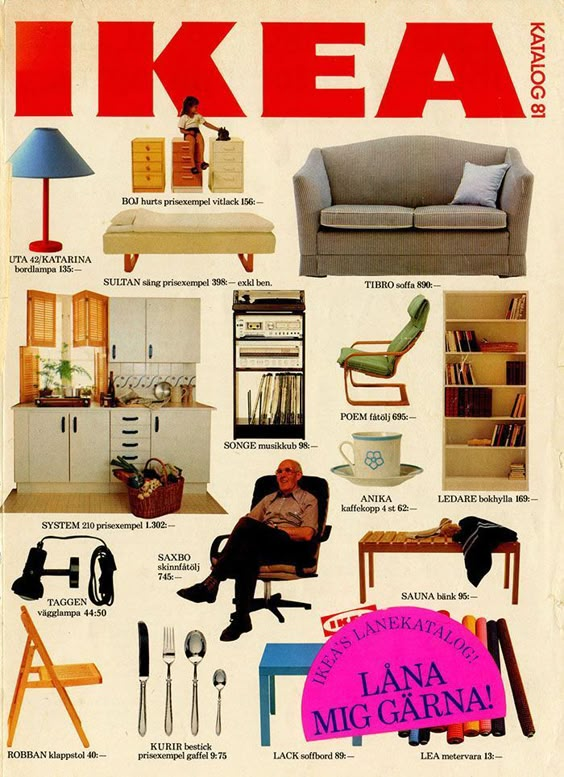
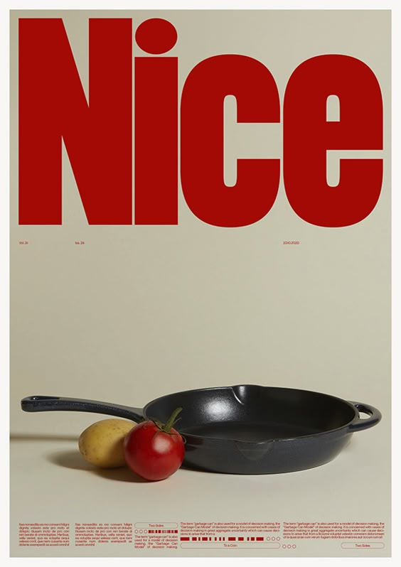
This style revisits the publications of the 1990s, using large typefaces, experimental layouts and a mix of nostalgic visual elements typical of the era.
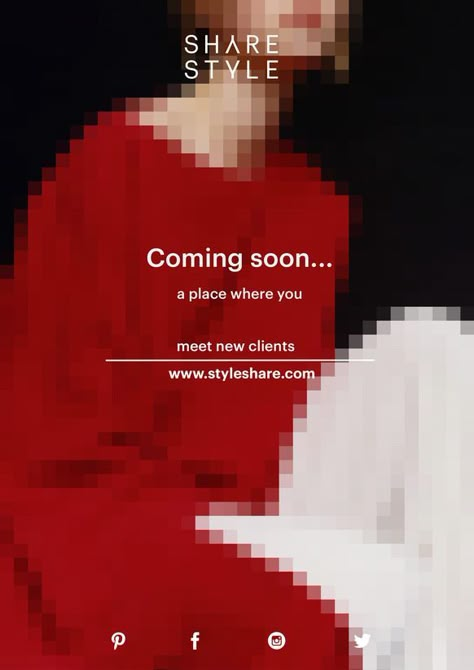
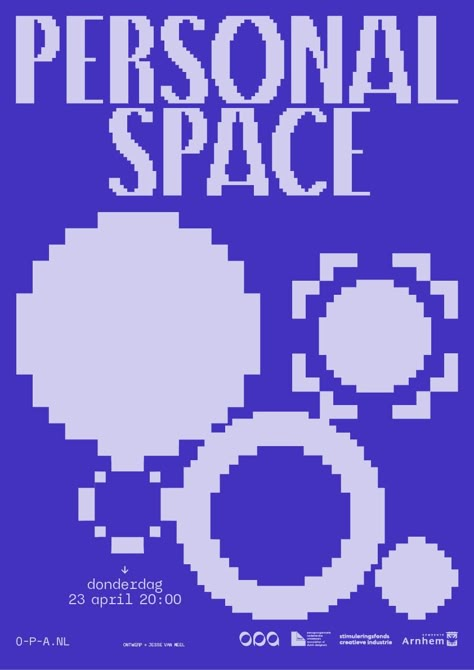
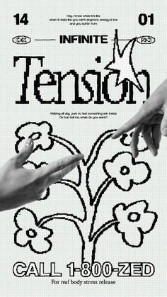
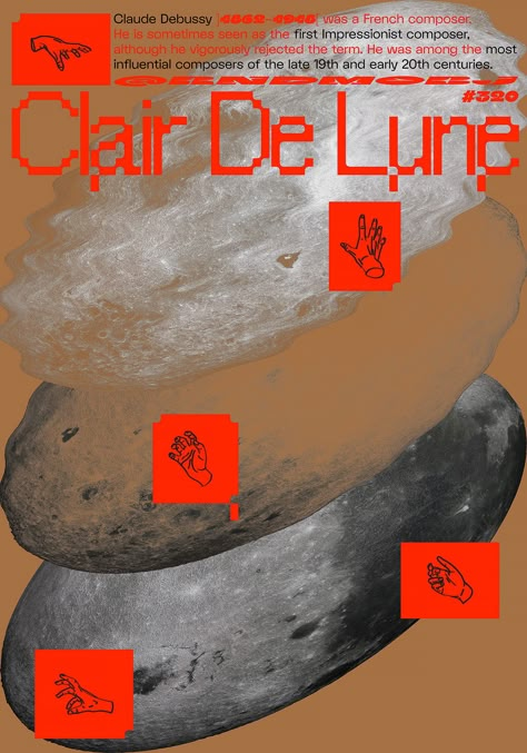
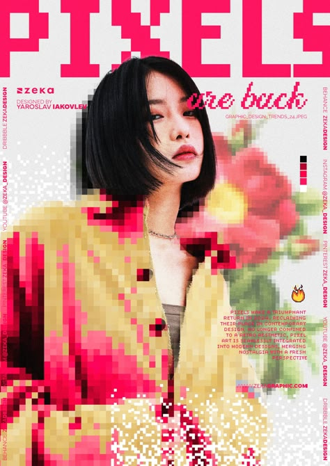
11. Retro Pixels
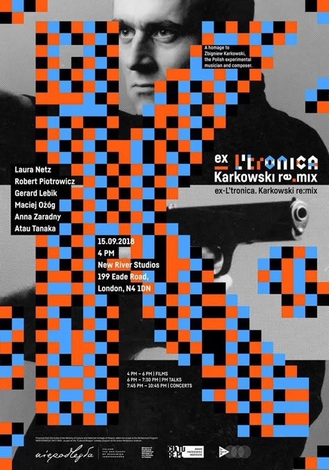
Inspired by the low-resolution graphics of video games and old technology, this style recreates the pixelated look with a retro touch.
12. Scandinavian
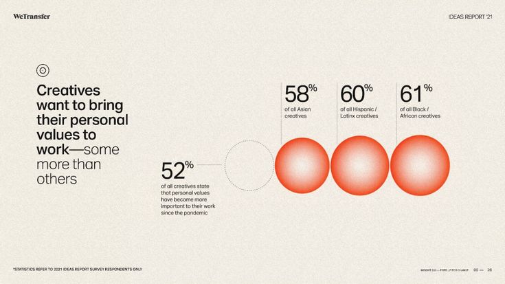
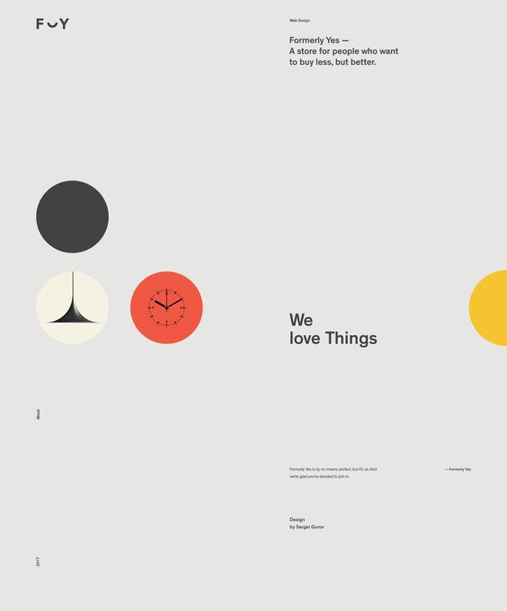
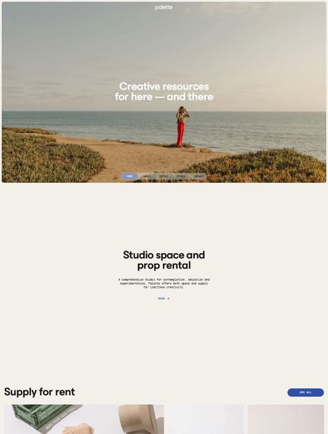
Characterized by simplicity, functionality and the use of clean shapes, this style focuses on minimalist aesthetics, with neutral colors and natural materials.
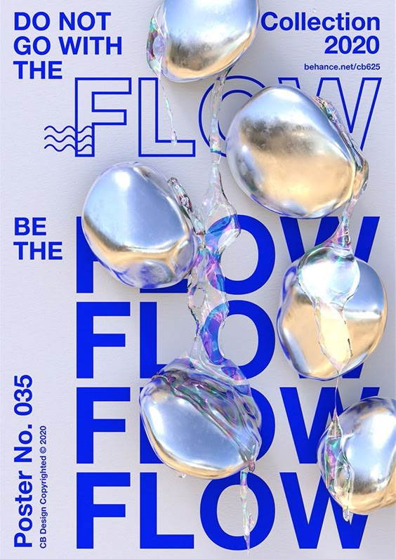
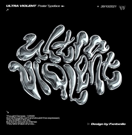
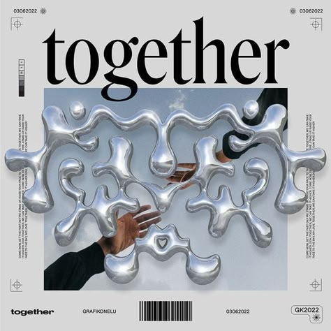
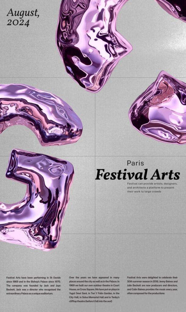
13. Metallic // Metallic Typography
This type of style simulates metallic surfaces, adding shine, reflections and a futuristic or luxurious touch to the designs.
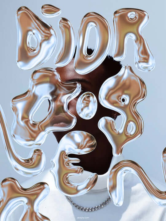
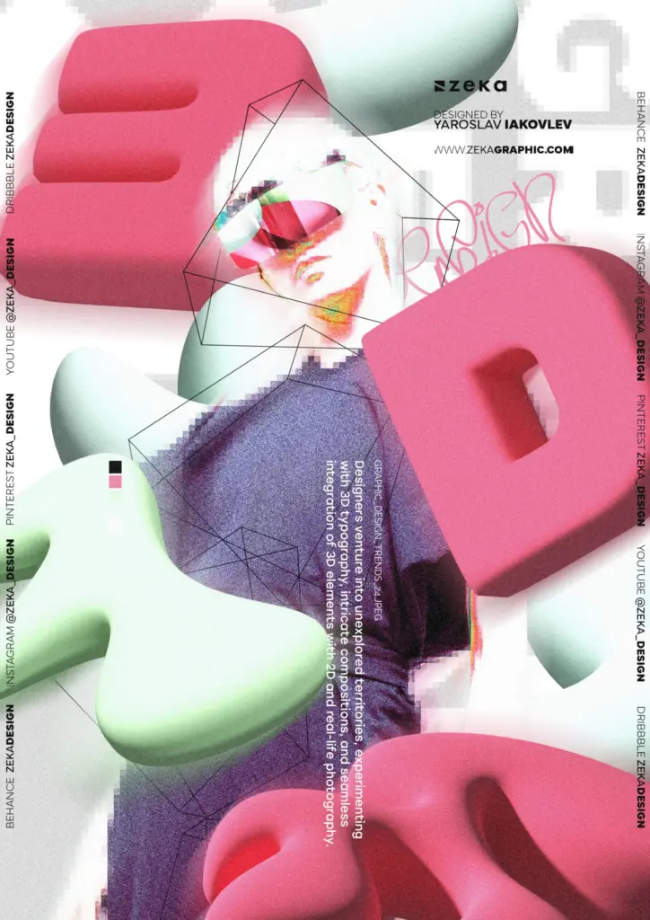
14. 3D Design
Three-dimensional images that incorporate realistic textures, providing depth and a tactile feel to the design.
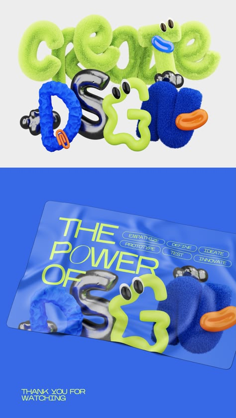
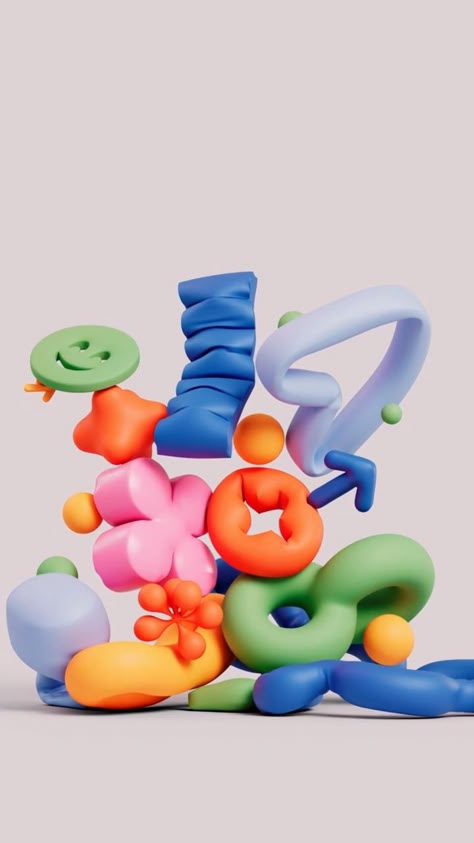
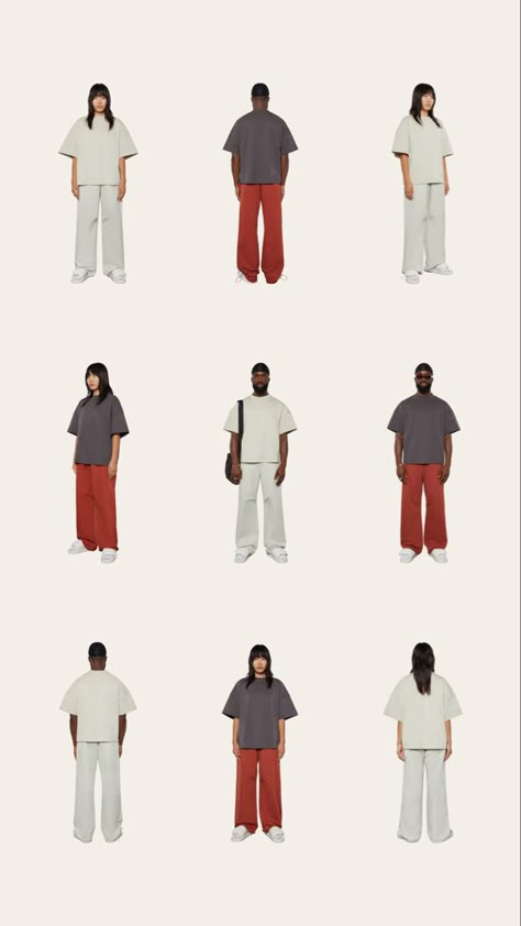
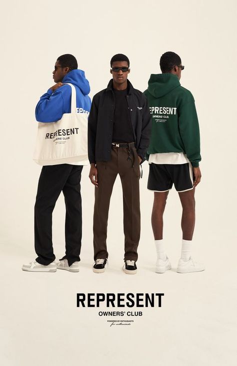
15. Minimalist Streetwear
Influenced by urban fashion, this style uses a minimalist aesthetic, with simple typography and few elements, maintaining a modern and cool air.
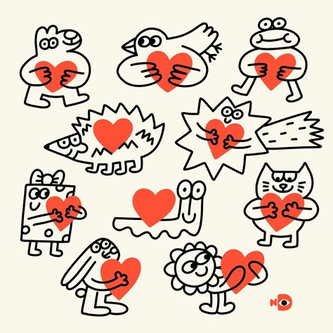
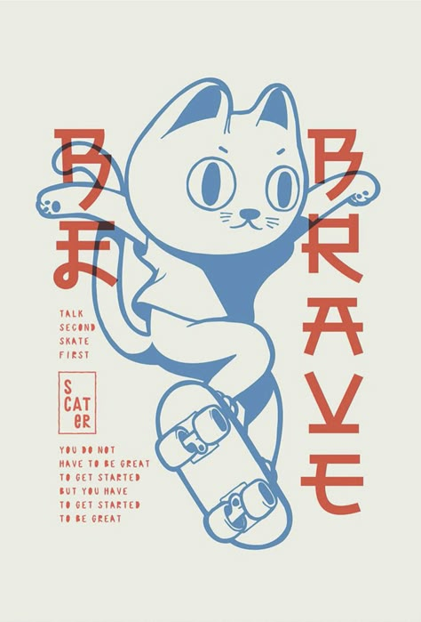
16. Hand-drawn Doodles
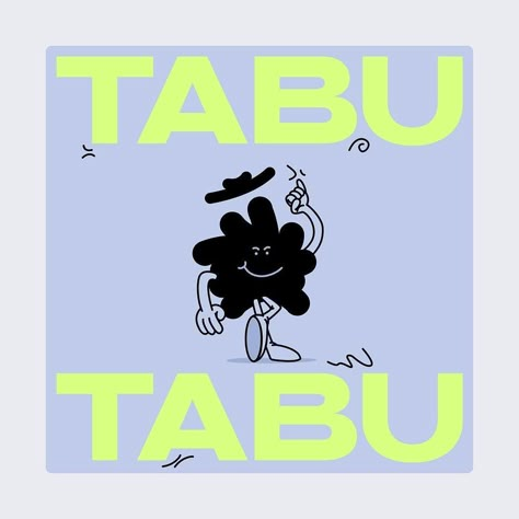
Designs that imitate or use hand-drawn elements, giving a spontaneous, personal and often playful touch.
17. Cartoon
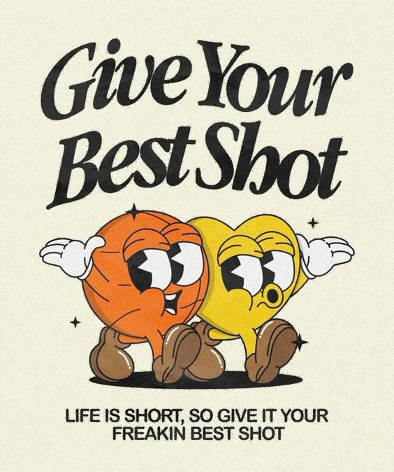
If you are looking for a fun, light and full of personality style, cartoons is an essential keyword. This graphic style includes animated characters, smooth lines and exaggerated expressions, perfect for projects that seek a playful and close connection with the audience. You can find it in both 2D and 3D forms, ideal for illustrations, branding and digital content that needs a humorous and creative touch.
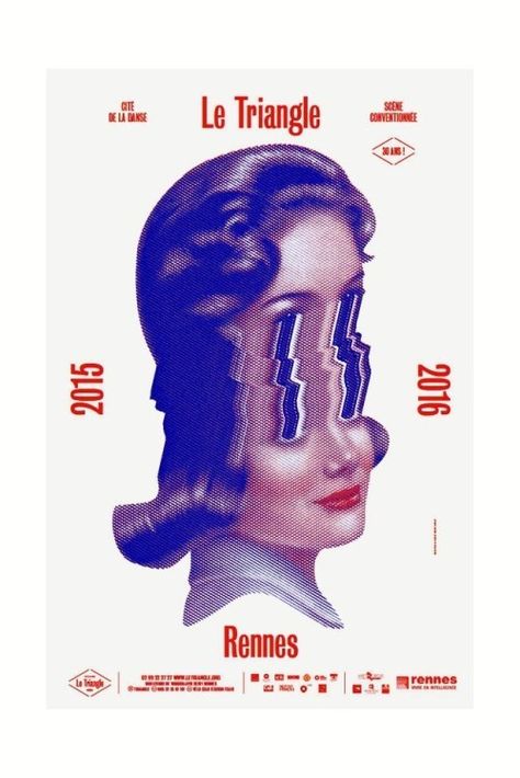
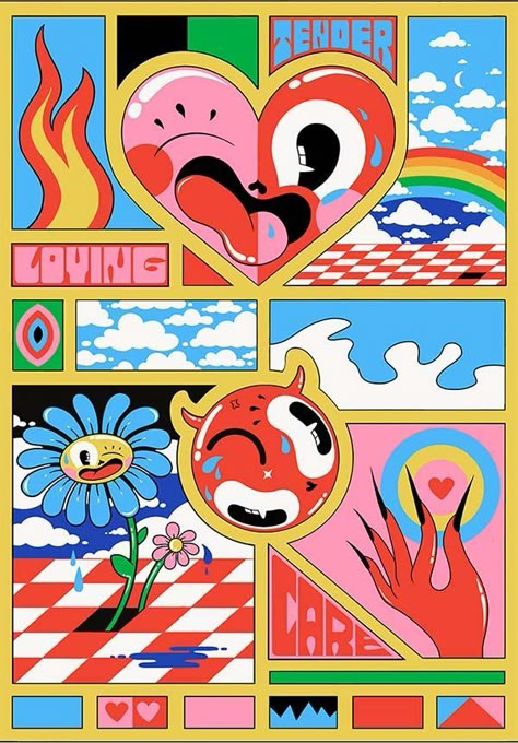
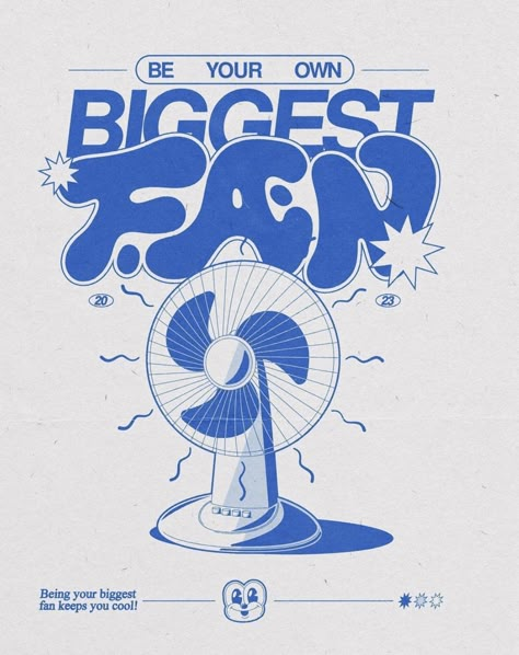
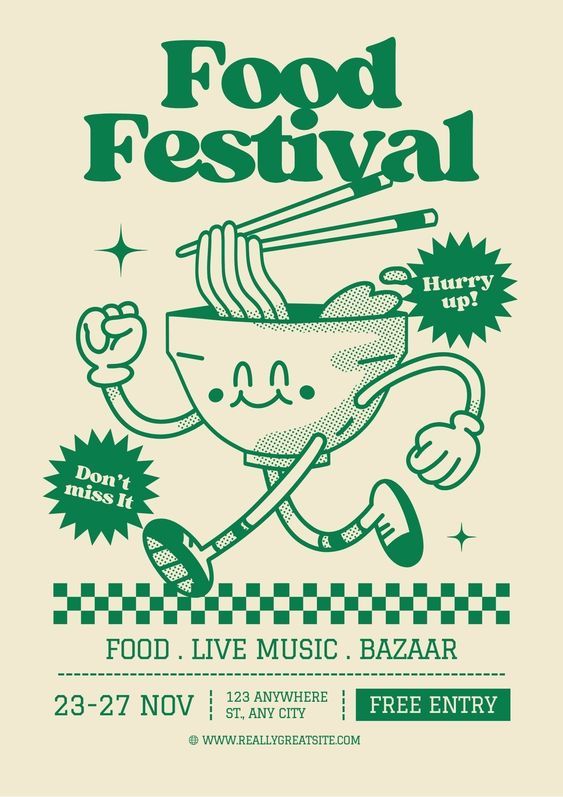
Retro Cartoon is a graphic style inspired by the classic cartoons of the mid-twentieth century, especially from the 1930s to the 1960s. This style is characterized by simple lines, exaggerated characters, flat colors and textures that evoke the aesthetics of early animated productions. It is especially popular in food businessesIt brings a nostalgic, fun and accessible feeling, perfect for connecting with customers in a friendly and memorable way. It is ideal for branding, menus, packaging and signage in restaurants or cafes looking for a vintage touch with a playful and dynamic air.
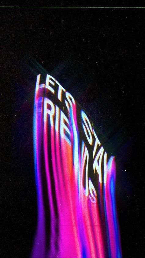
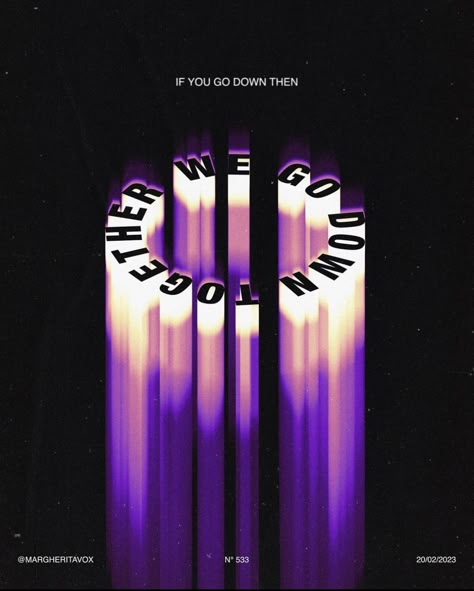
18. Trippy // Liquid Type // Melted Type // Fluid Typography // Liquid Retro Display Typeface
Typefaces that seem to move or flow, creating a sense of psychedelia or fluidity. It is a very striking and experimental style.
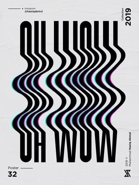
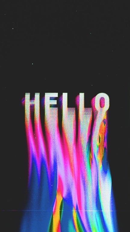
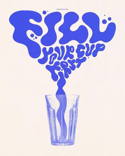
Retro typefaces that seem to melt or be in motion, recalling visual styles of the 60s and 70s.
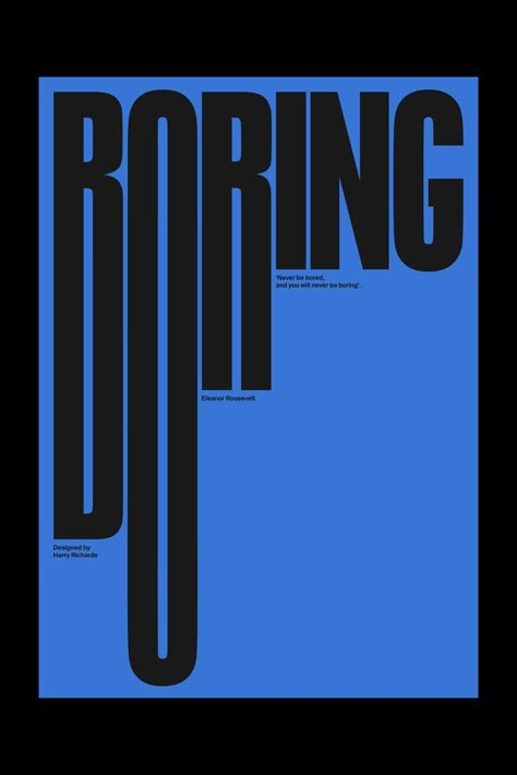
19. Bold Minimalism
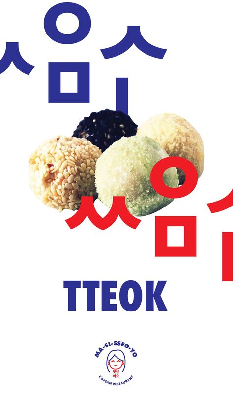
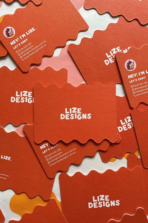
Bold Minimalism is an industrial design style characterized by clean, simple lines and shapes, with a focus on functionality. In this style, decorations are kept to a minimum.
Generally, the bold minimalism follows one of two approaches: either everything is reduced to the essentials, or a single dramatic element is used to provide visual interest. This style manages to create striking designs with few resources, maintaining simplicity without losing visual strength.
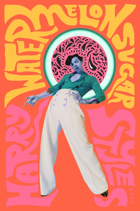
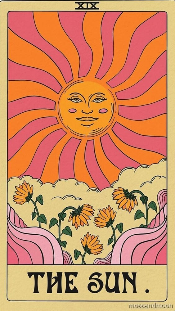
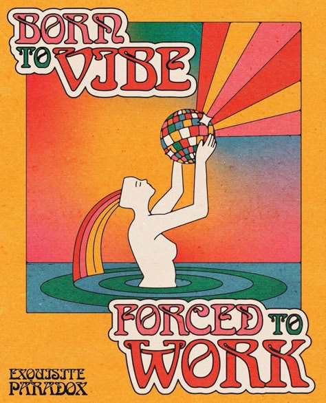
20. Psychedelic
This style plays with bright colors and distorted shapes reminiscent of the artistic movements of the 60s and 70s. It seeks to attract through hypnotic and VERY saturated images.
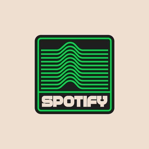
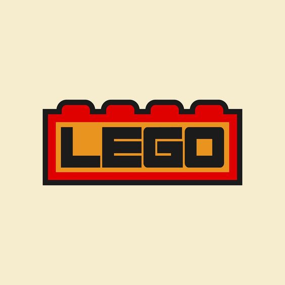
21. Retro Logo
Logotypes that mimic the style of bygone eras, evoking nostalgia and reliability by using classic typography, colors and shapes.
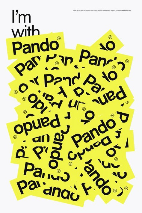
22. Stickers
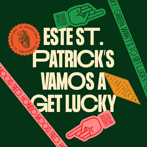
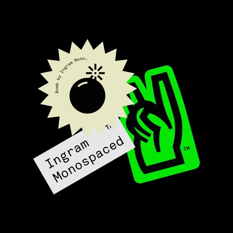
The stickers se han convertido en una tendencia popular en el diseño gráfico, ofreciendo una manera divertida y versátil de añadir personalidad y estilo tanto a productos digitales como físicos. Puedes buscar «sticker sheet», «brand stickers» o «sticker packaging» para explorar aplicaciones en redes sociales, packaging y merchandising.
One of the reasons why the stickers are so popular is their ability to convey emotions, messages and brand identity in an interactive and playful way. With the rise of platforms such as Instagram and TikTok, where the stickers are widely used in Stories and publications, designers are finding new ways to create engaging and shareable designs.
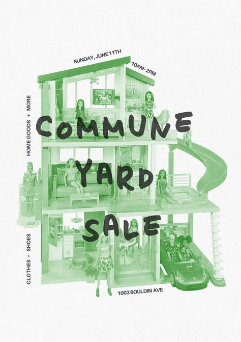
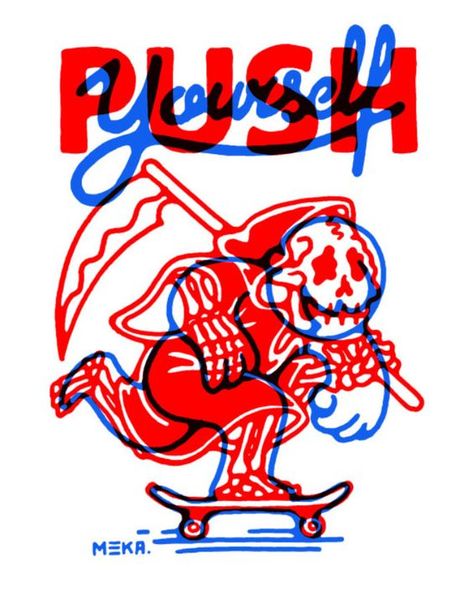
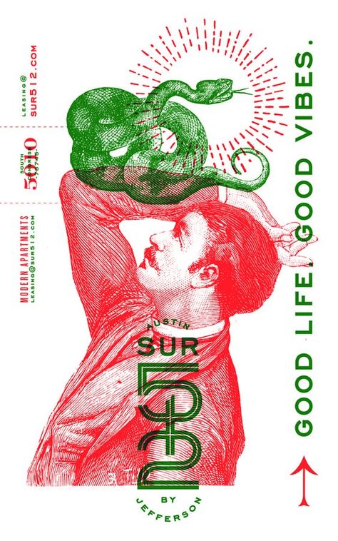
23. Overprint
A printing technique where one color is printed over another creating a visual overlay that adds texture and depth.
24. Maximalism
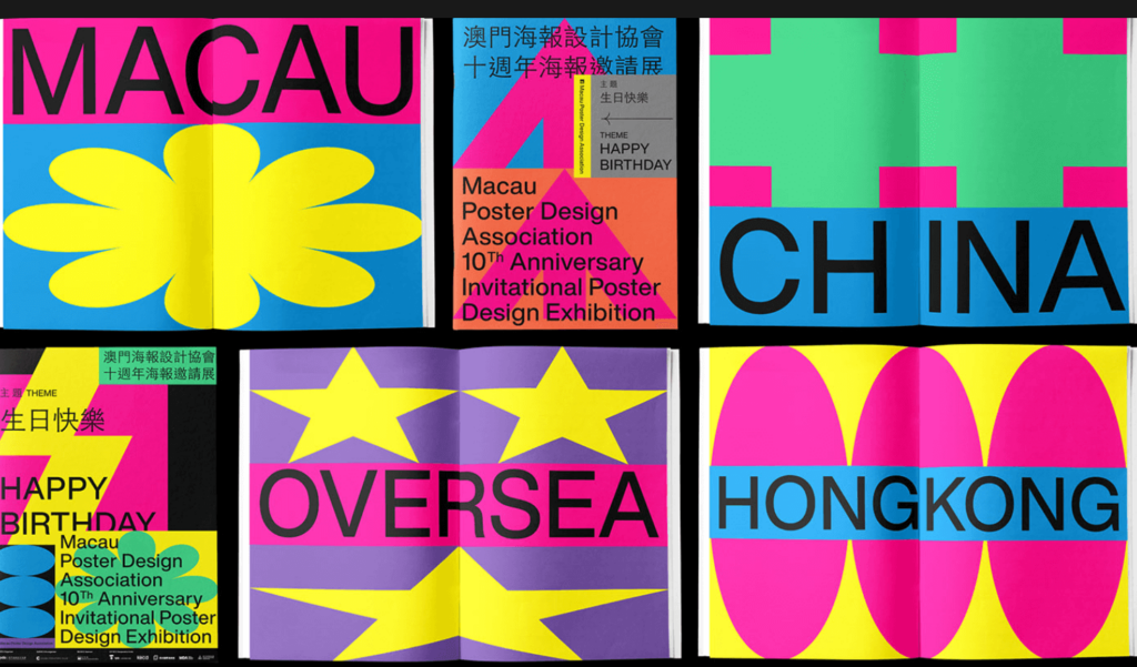
Maximalism is the opposite of minimalism. This style rejects the idea of "less is more" and celebrates visual abundance. It is characterized by the use of bold color combinations, overlapping images, prominent typography and repeated patterns. The maximalism is an explosion of creativity that seeks to capture attention through excess and exaggeration. Ideal for projects that want to stand out with energy, controlled chaos and an aesthetic rich in detail.
25. Utilitarian Design
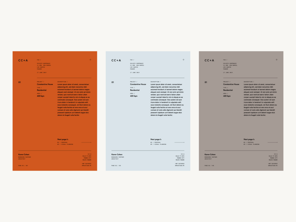
The Utilitarian Design focuses on simplifying the user experience by eliminating unnecessary elements. This trend seeks to achieve maximum functionality through minimalism, clear navigation and easy-to-understand content. The main goal is to make websites, applications and digital products as efficient as possible, prioritizing usability over ornaments or visual complications.
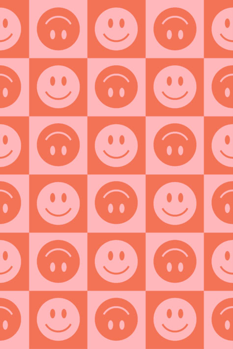
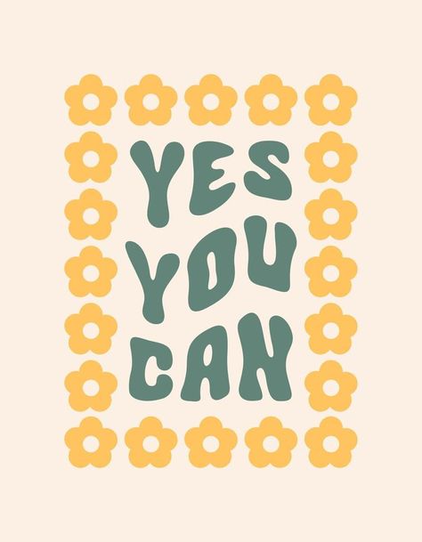
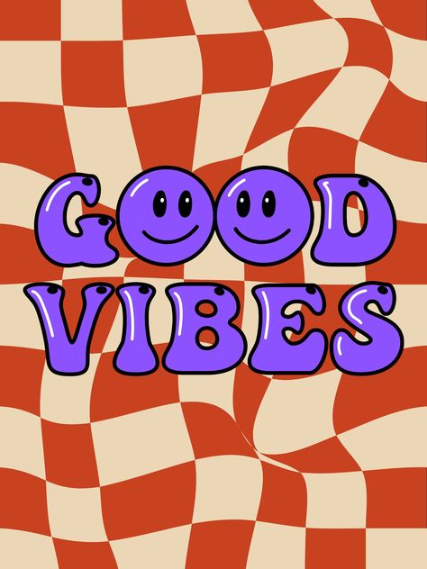
26. Indie Groovy Graphic
The style Indie Groovy Graphic is a mix of indie and retro, inspired by the psychedelic aesthetic of the 60s and 70s. This style uses vibrant colors, wavy shapes, fluid typography and elements that evoke a relaxed, free and artistic feeling. It is associated with indie culture and projects that seek to convey a nostalgic, fresh and youthful vibe, perfect for capturing the essence of independent creativity and counterculture.
27. Cybercore Design
Aesthetics influenced by technology and futurism, with the use of neon colors, technological shapes and a futuristic air.
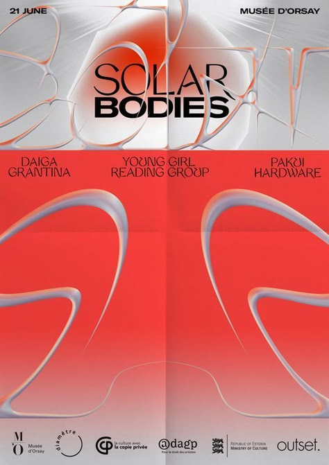
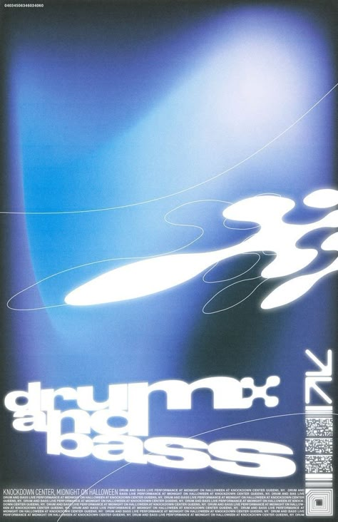
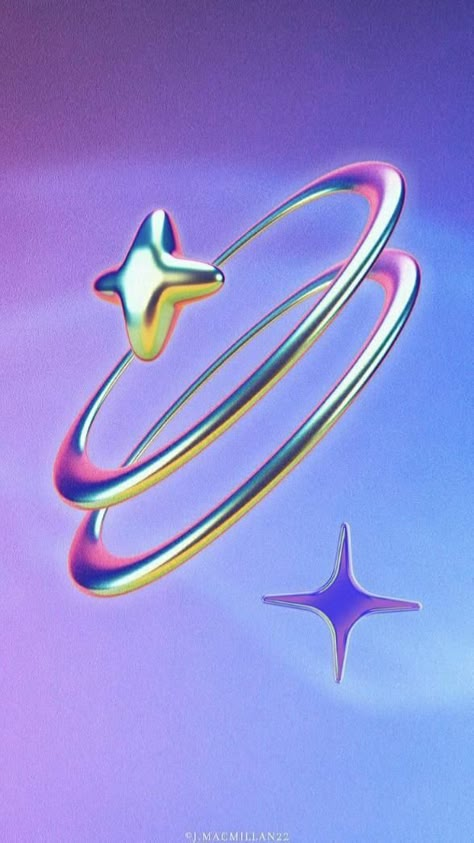
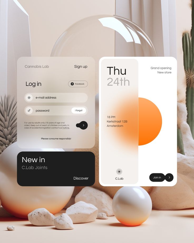
28. Glass Blur & Distortion // Glass Effect // Glass 3D
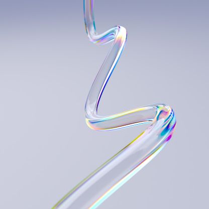
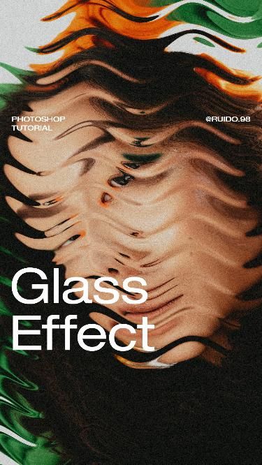
Blur or distortion effects that mimic the appearance of glass or translucent surfaces, adding a layer of visual intrigue.
29. Motion
Motion has transformed the way designers capture the public's attention. In fact, we owe a single article to this trend (in the future we promise to have it VALE).
For many years, static images were the logical medium for advertising. However, making those images "move" was considered almost magical. Today, the motion is a powerful tool in digital design, creating animations and transitions that not only attract the eye, but guide the user experience in a fluid and immersive way. It is very common in digital advertising, social networks, y user interfaces (UI)where moving elements add dynamism and personality to the designs.
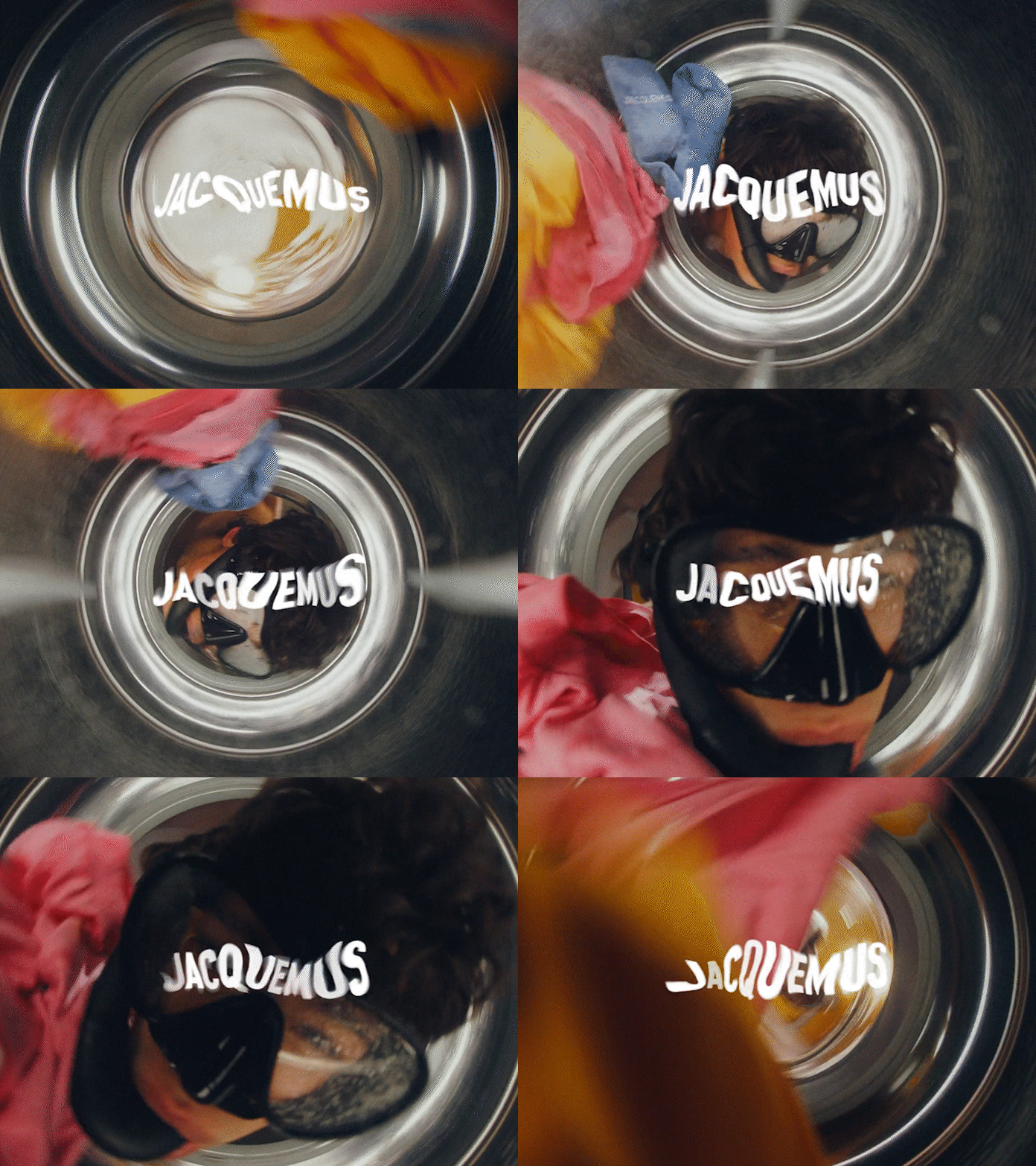
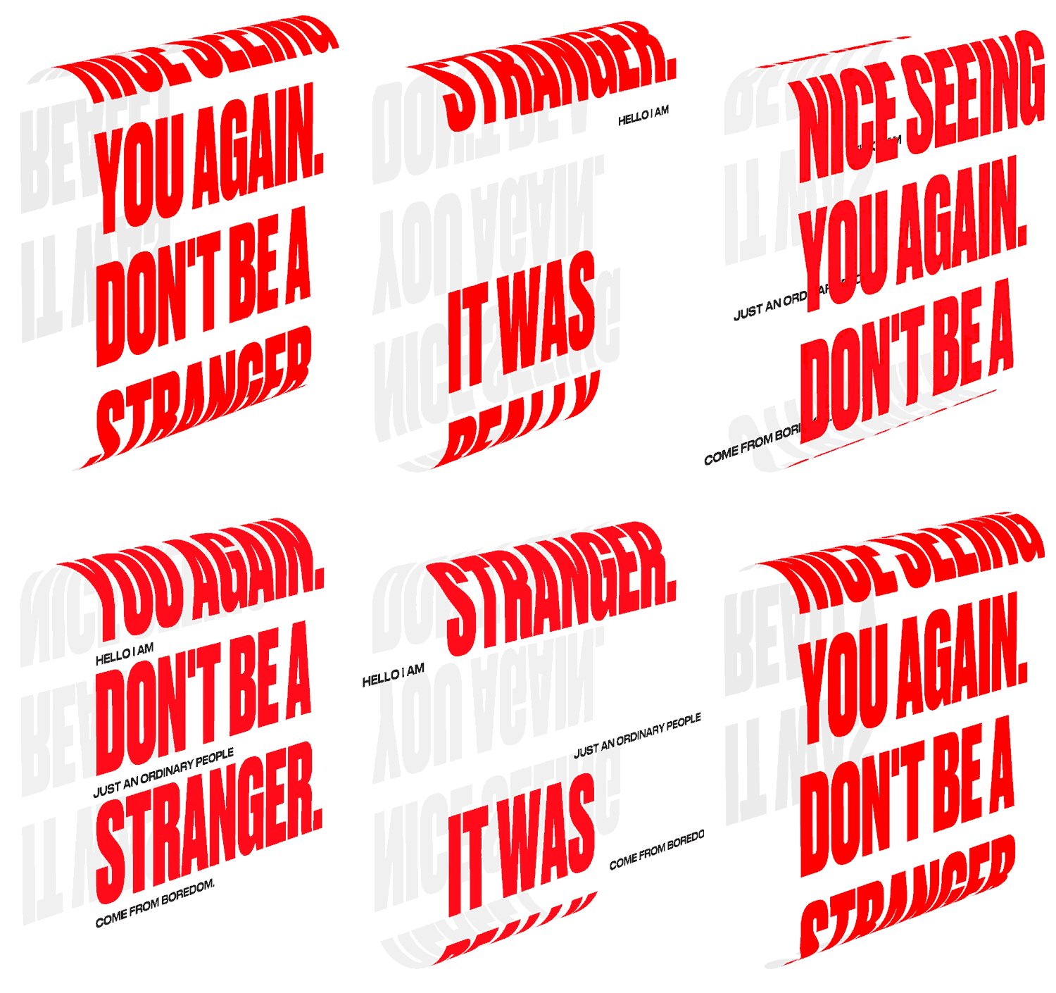
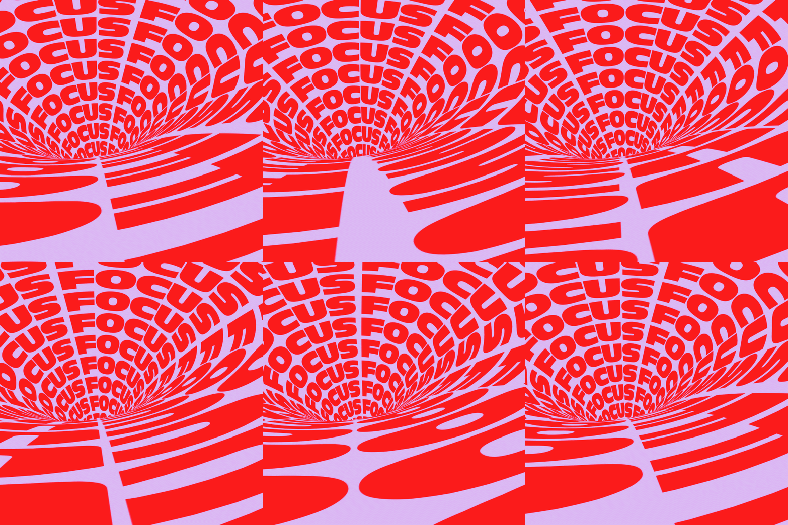
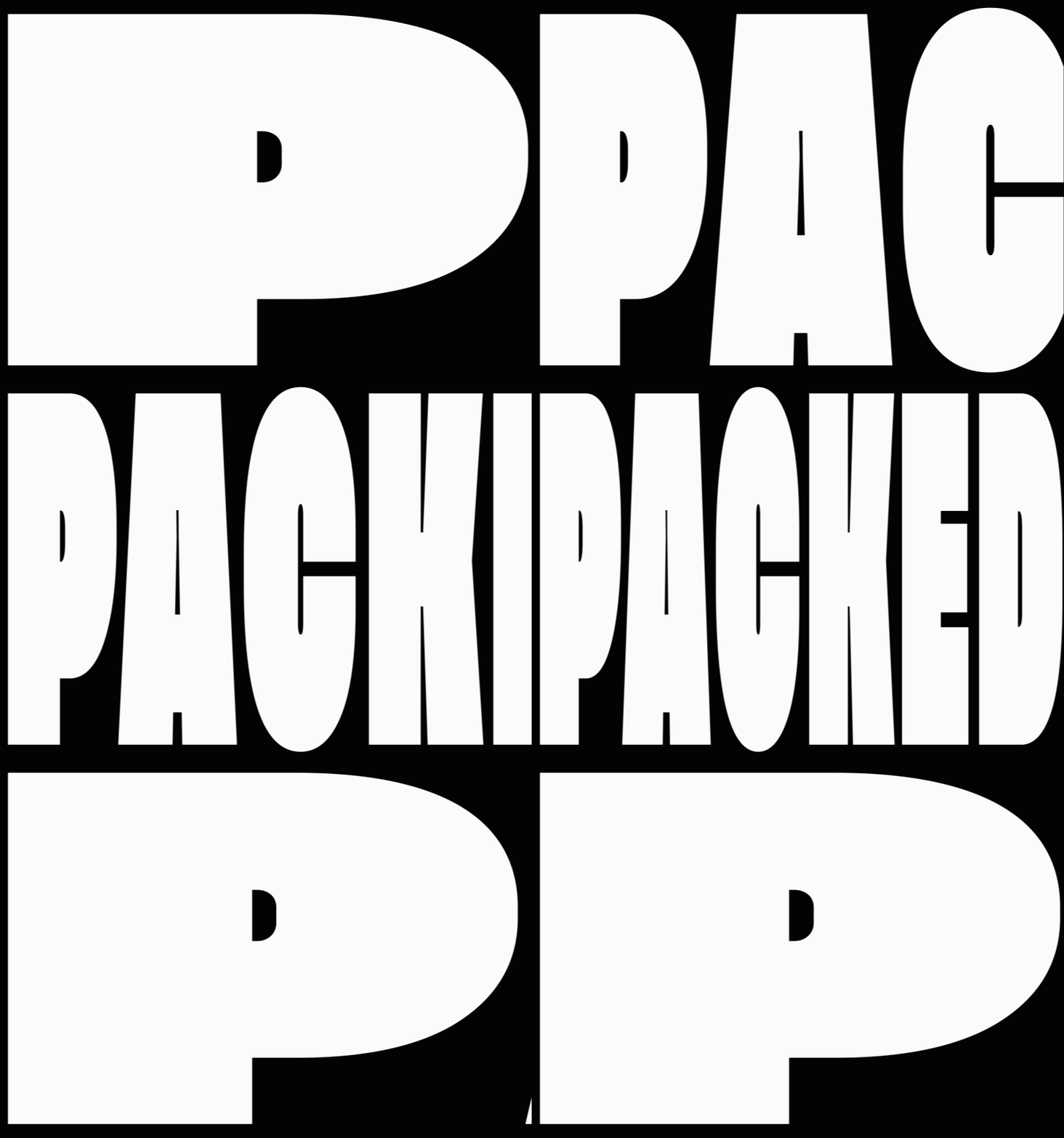
Explore the keyword "Motion» en Canva, Pinterest, Savee y Dribbble para descubrir cómo las marcas están utilizando imágenes en movimiento y formatos como GIF y Lottie to create more immersive and impactful experiences, without the need for large budgets.
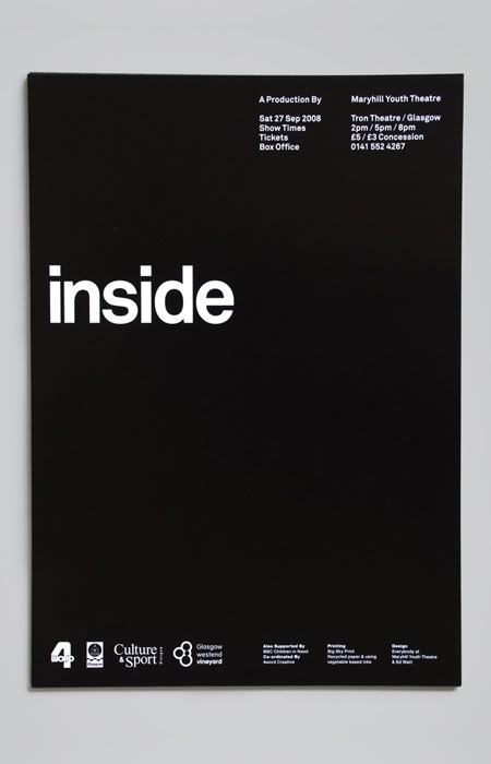
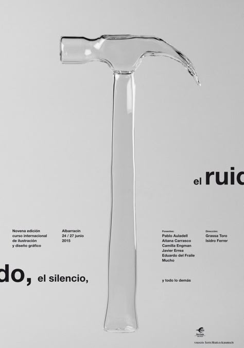
30. Minimalism
Less is more. This style focuses on minimizing visual elements, with simple colors, clean typography and lots of white space.
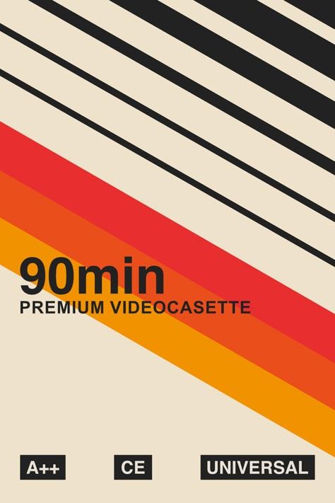
31. Retro Boho Graphic
Fusion of retro and bohemian elements, with soft textures, earthy colors and relaxed patterns.
32. 3D Abstract Posters
Abstract three-dimensional designs that play with geometric shapes and colors, creating striking and dynamic images.
33. Y2K Shapes
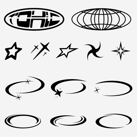
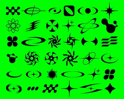
Y2K Shapes brings back the geometric and organic shapes characteristic of the late 90s and early 2000s. These shapes are often shiny, rounded, with metallic or chrome effects, and futuristic touches. Smooth curves, bubble elements and graphics that look like they are taken from emerging technology interfaces dominate this style. It is ideal for projects that seek a nostalgic design, evoking the retro-futuristic digital aesthetics of the Y2K era, with a touch of dynamism and modernity.
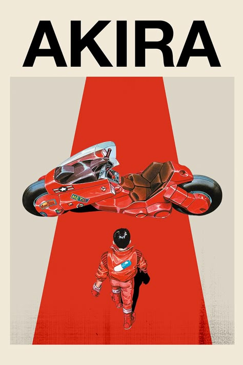
34. Anime Poster Design
Influenced by the visual style of the Japanese animeThis style uses bright colors, eye-catching typography and stylized characters.
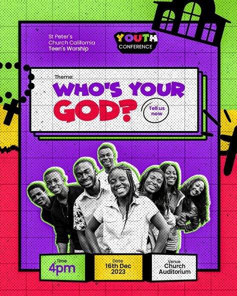
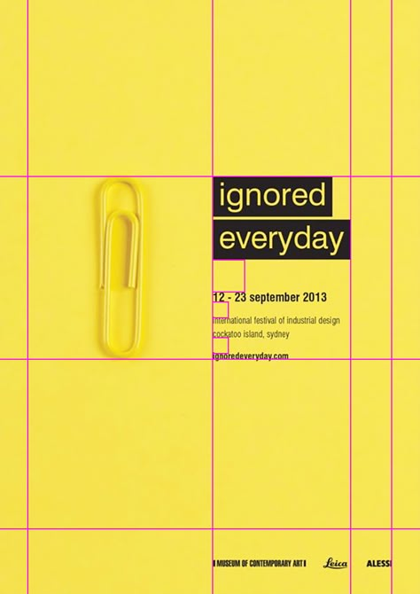
35. Visible Grid Lines
Designs where grid lines (usually invisible) are an active part of the composition, adding structure and visual order.
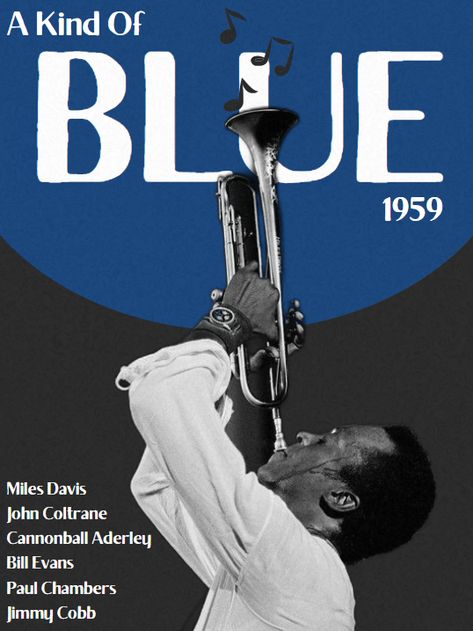
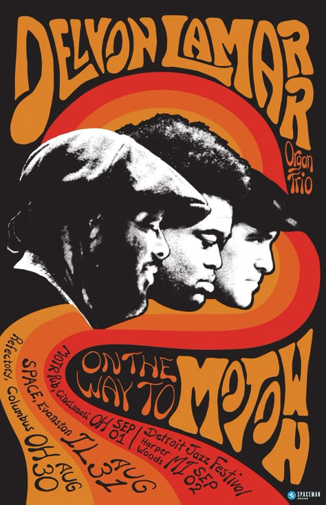
36. 60's Jazz Posters
Retro aesthetics inspired by jazz concert posters of the 1960s, with abstract shapes and vibrant colors.
37. Foil printing
This type of finish not only adds shine, but also offers a unique texture that stands out visually, which makes it an excellent choice for branding, luxury products, o event invitations.
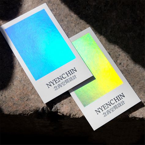
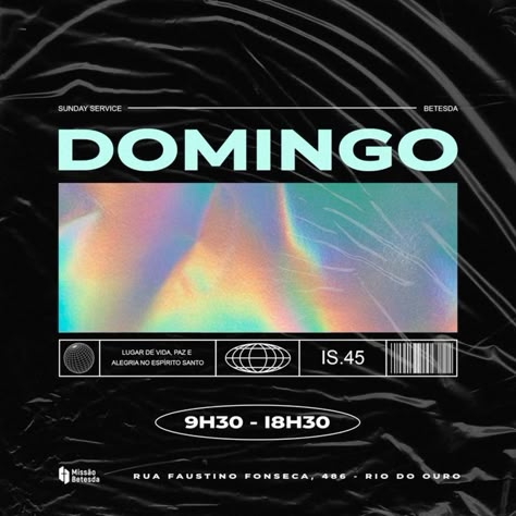
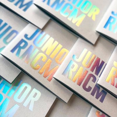
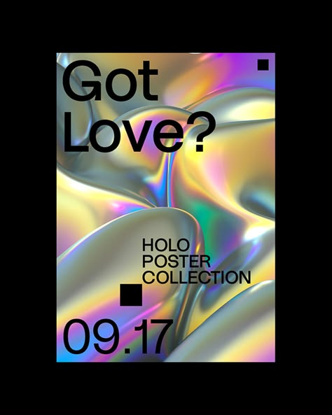
Explore the use of foil en Canva, Pinterest, Savee y Dribbble para encontrar inspiración sobre cómo puedes aprovechar esta técnica para crear diseños que llamen la atención y destaquen por su acabado premium.
38. Graffiti in Graphic Design
From branding From urban-inspired to bold social media graphics, graffiti-inspired design is making a powerful statement in the world of graphic design. One of the key characteristics of this style is its focus on the self-expression e individualityGraffiti artists often use their work as a means of personal expression. This same spirit of creativity and challenge is reflected in graphic design projects influenced by graffiti.
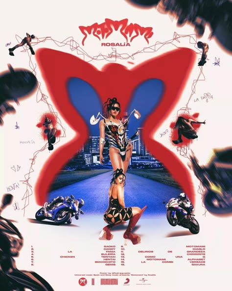
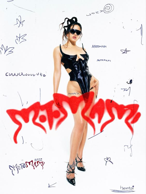
Either through hand-drawn typographyWhether abstract shapes, abstract forms or vibrant color palettes, designers are embracing the rebellious spirit of graffiti to create visually striking and memorable designs.
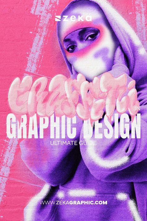
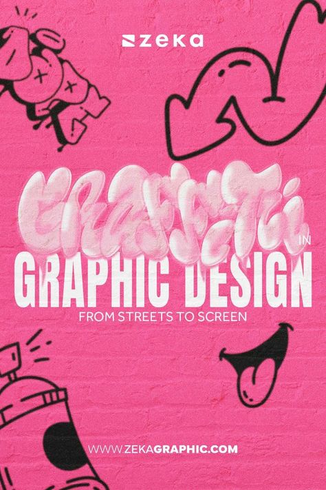
Search for the keyword "Graffiti in graphic design". en Canva, Pinterest, Savee y Dribbble para inspirarte en cómo este estilo puede aportar originalidad y audacia a tus proyectos de diseño.
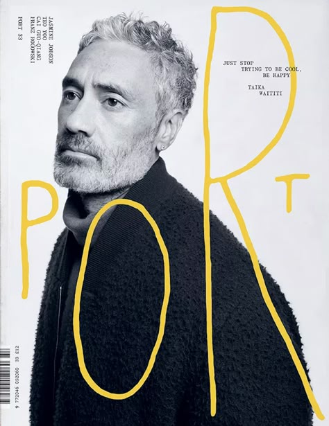
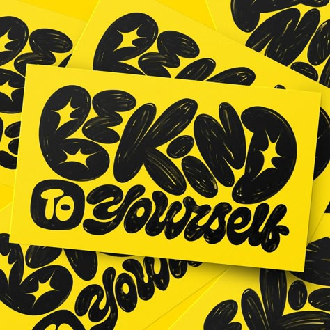
39. Hand Lettering
Custom, hand-crafted typography adds a unique and artistic touch to designs.
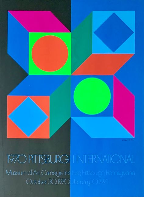
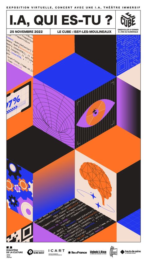
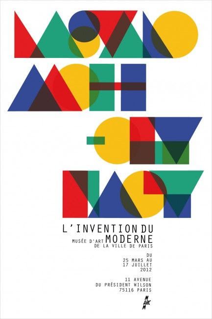
40. Cubism Design
Inspired by cubist art, this style fragments and rearranges objects into geometric shapes to create abstract compositions.
41. Analogue Design
Designs that evoke analog techniques, such as engravings or hand prints, with a nostalgic touch.
42. Folk Botanical
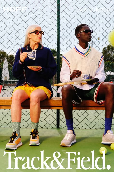
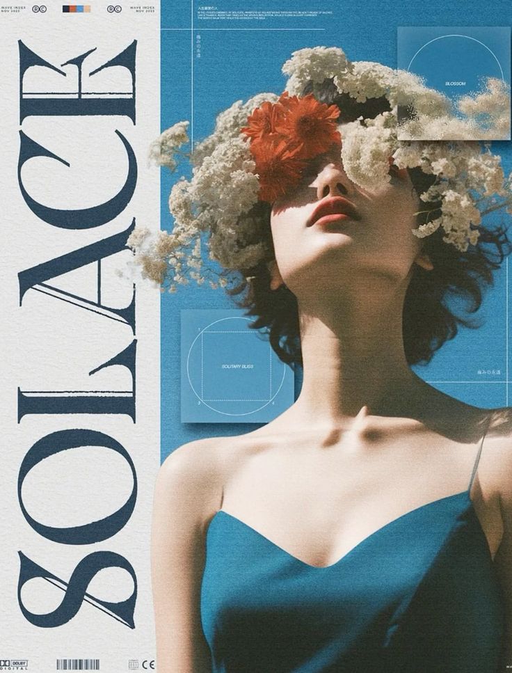
Prueba «folk botanical» para buscar referencias de hojas, flores y ramas con un tratamiento ornamental. Puedes concretar con «folk botanical packaging» para envases o «folk botanical pattern» para patrones. Fíjate en la repetición de las formas, la paleta y la textura antes de elegir qué detalle encaja con tu proyecto.
43. Pop Art
Style inspired by the popular culture of the 60's, with saturated colors, thick borders and themes related to mass media. Focuses on the commercial and the accessible, transforming everyday objects into art.
44. Futurism
Style that seeks to represent the future through aerodynamic shapes, advanced technology and a clean and modern aesthetic. Ideal for projects that want to convey innovation and progress.
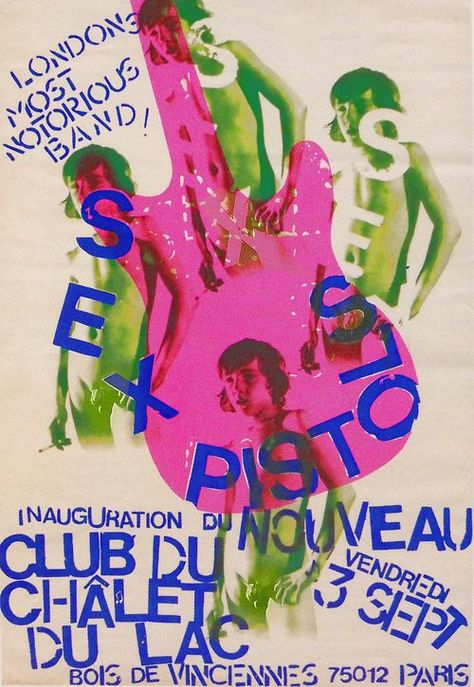
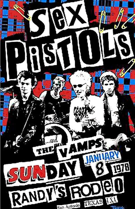
45. Punk Poster
Raw and rebellious aesthetics, with collages, cut typography and strong colors, inspired by the punk movement of the 70s and 80s. It transmits a DIY and defiant attitude.
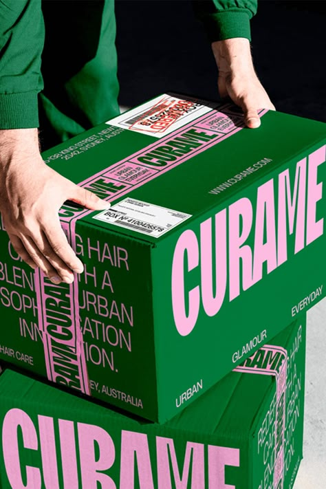
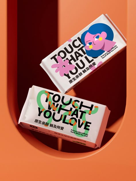
46. Packaging Illustration
Customized and detailed illustrations used in packaging design to make them unique and attractive. They add a creative touch that differentiates products in the market.
47. Duotone colors
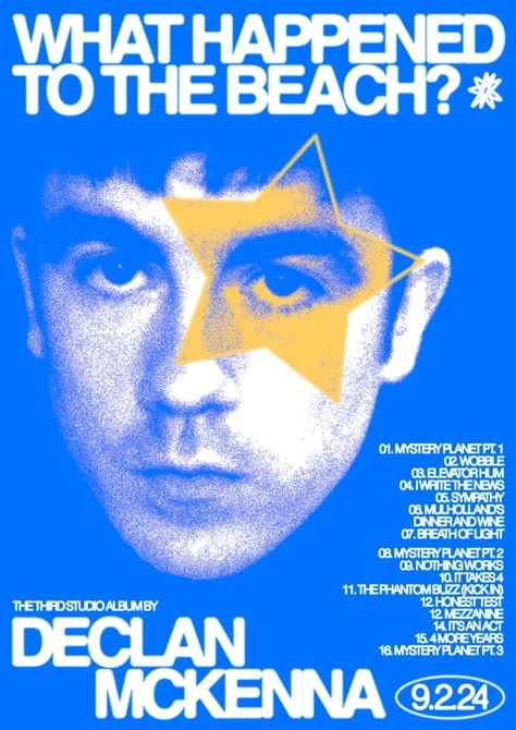
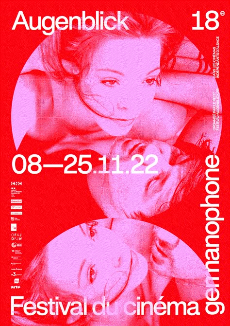
Duotone Colors is a graphic design technique that uses two contrasting colors to create a visually striking image. This style simplifies the color palette, but highlights key details by playing with contrast.
48. Texture
Texture is a design element that adds depth and dimension to graphics by simulating tactile surfaces, such as paper, wood, fabric or natural materials. In graphic design, texture is used to make designs feel more real and tangible, creating an emotional connection with the viewer.
49. Serif Designs // Sans Serif Designs
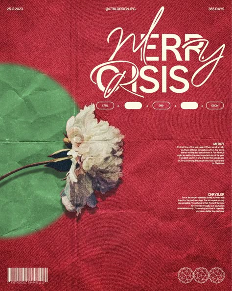
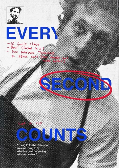
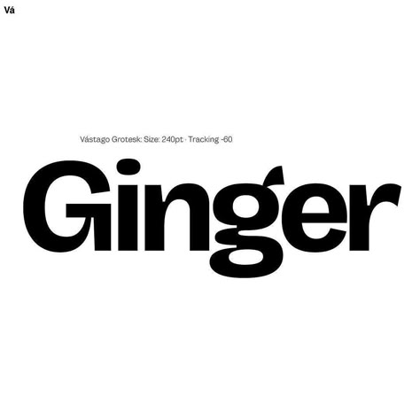
The use of serifs in the typography brings a classic and sophisticated air to the designs. This style is ideal for projects that seek to convey elegance, reliability and tradition. Many brands are changing their logos for serifs and sans serifs. Is there an invasion of these typefaces? We should create an article talking about this and we will (pinky promise).
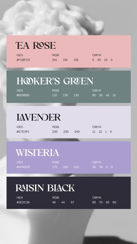
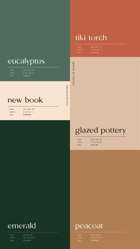
50. Muted Color Palette
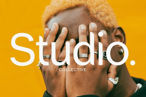
The muted color palettes offer soft, desaturated tones that create a calm and sophisticated atmosphere. This style is perfect for minimalist projects or those seeking a relaxed and natural aesthetic.
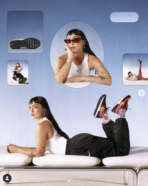
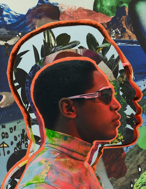
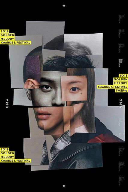
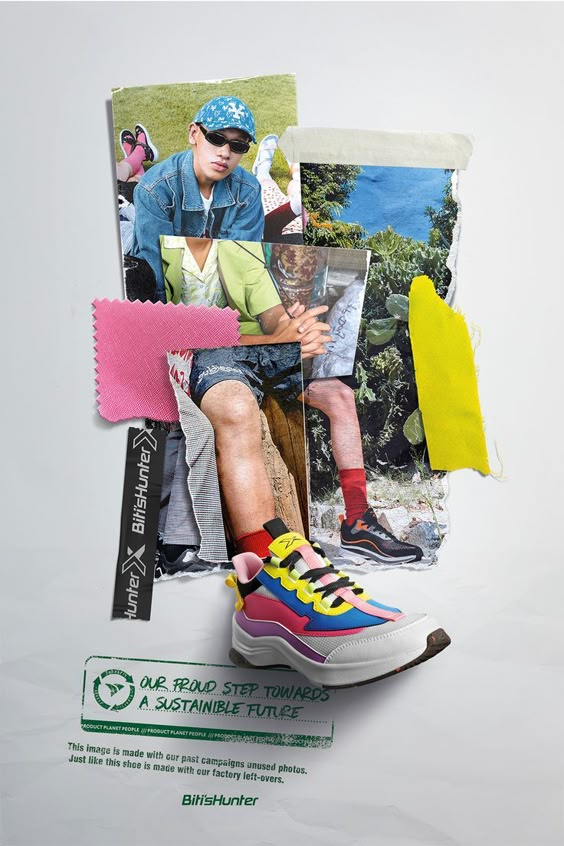
51. Photo Layering
Photo layering consists of superimposing several images to create depth and textures in a design. This approach adds dynamism and visual complexity, ideal for projects that seek an artistic or experimental look.
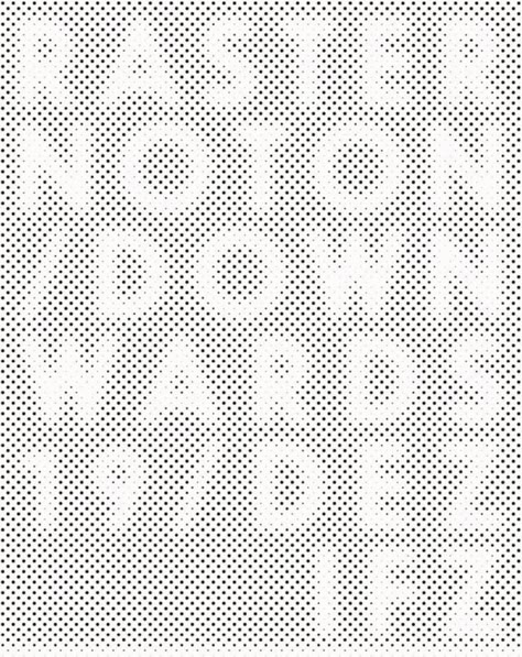
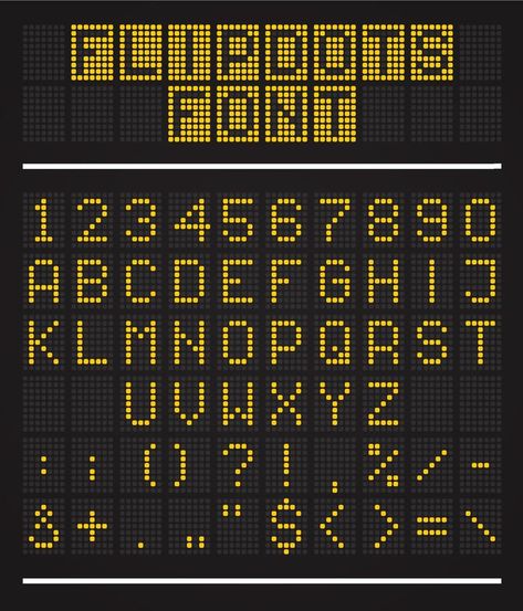
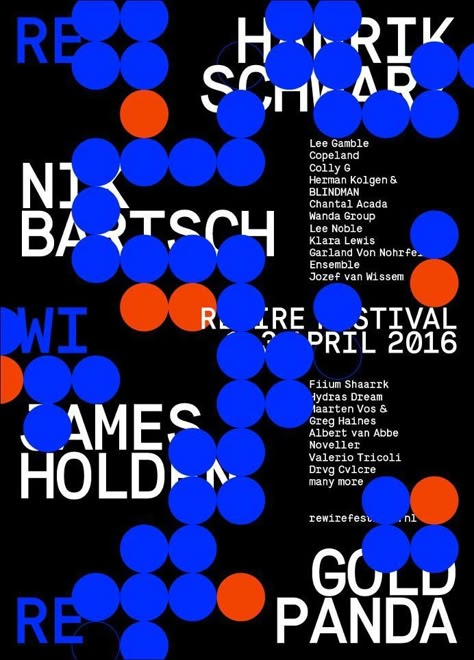
52. Dot Display Graphics
The Dot Display Graphics are based on the use of dots to create shapes or typographies, evoking a retro style inspired by the first digital screens or dot printers. It is an excellent option for designs with a technological or vintage touch.
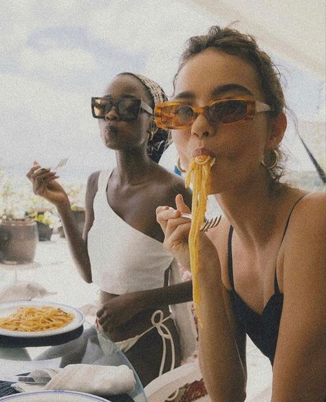
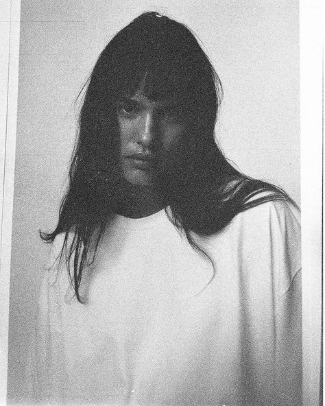
53. Grainy Film Look Photography
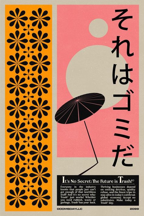
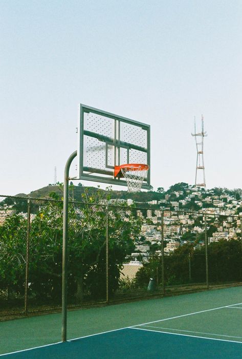
The style of photography with the effect of film grain imita el look de las cámaras analógicas, añadiendo una textura rugosa y nostálgica. Prueba «grainy film portrait» o «film grain editorial» y compara cuánto grano necesita la imagen para mantener su legibilidad.
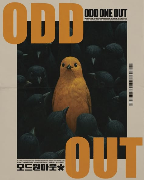
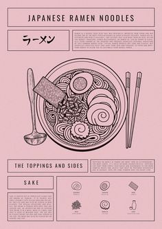
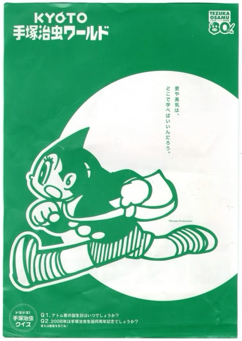
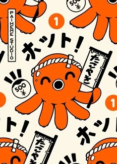
54. Retro Japanese Poster
This style is inspired by the retro Japanese posterswith vibrant colors, striking typography and asymmetrical compositions. It is ideal for projects that seek an exotic, cultural and energetic look.
55. Bento Layout
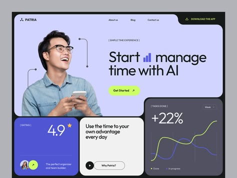
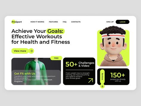
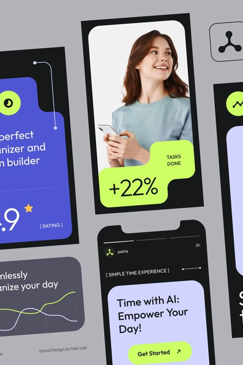
The Bento layout se inspira en las cajas bento japonesas, organizando el contenido en secciones o módulos claramente definidos. Es perfecto para diseños que necesitan ser visualmente claros, ordenados y fáciles de navegar. Prueba «bento grid website» para webs, «bento dashboard UI» para interfaces o «bento presentation» para presentaciones: el formato ayuda a concretar la búsqueda.
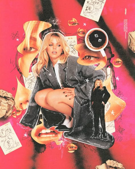
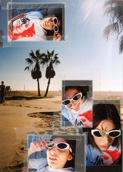
56. Collages in Graphic Design
The collages in graphic design combine multiple visual elements, such as photos, illustrations, textures and typography, into a single composition. This style allows mixing different media and styles, creating a dynamic and versatile aesthetic that can range from chaotic and expressive to orderly and conceptual. The collages are widely used in branding, album covers, posters y social networksoffering an artistic way of telling visual stories and conveying emotions through the juxtaposition of images.
Thanks for making it this far! I know it's a long list, but I hope it's inspired you as much as it has me.
For reaching the end you have a prize. Here I leave you the link to all the trends I've told you about, saved in our Pinterest, we hope you find it very useful!
Let me know what other trends I should add, and let's keep sharing creative inspiration - let's keep this list moving!


